We got upgraded from Xl2013 32 bit to 2016 64bit and I have a big problem with charts created in the old version
I have a model with 30 charts or so. They are all formatted to a corporate standard which is messy, non-standard colours, marker meanings etc. I can rebuild the charts from scratch but it takes ½-1hr each and I have a number of models with about 30 in each.
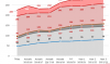
They aren't complex technically, a number of series as Stacked Area, a number of lines to highlight subtotals at each new area, and a blue metric line against which they are to be visually compared. The metric line needs to be on a secondary axis as it has a completely different scale and above the top of the stacked areas so it's clearly visible.
The charts were created last year using Excel 2013. Now we have 2016, and I need to update them with a new year of data.
I try and amend the upper bound of the secondary axis, all chart elements disappear.
When I try and change a series to primary that works, but when I set it back to secondary they all disappear.
When I try and delete the series to add it, if I press or right click delete, that series stays but all others disappear. That happens irrespective of primary or secondary.
So I managed to delete the series using the select chart data dialog box (I forgot that even existed), and add it back. But as soon as I try and make it secondary axis, everything disappears again.
Before: The blue line has to be on a secondary axis to appear above the rest. The blue line was originally on a secondary axis with an upper bound of 75 which needs setting to 85 so the line and labels fitted the chart.

Changing secondary axis upper bound: New number entered in Maximum as below

After: When I hit return

What I can do to fix it?
I can change other aspects, for example amending gridlines is fine.
One other curious feature, when I tried to delete the series by selecting and hitting the Del key, it deleted all the series except that. That applied when I tried to delete any series on primary or secondary axis, the only way I can delete a series is by using the Select Data dialog box which is a pain.
it's not just one rogue chart, it's any with a secondary axis.
I have a model with 30 charts or so. They are all formatted to a corporate standard which is messy, non-standard colours, marker meanings etc. I can rebuild the charts from scratch but it takes ½-1hr each and I have a number of models with about 30 in each.
They aren't complex technically, a number of series as Stacked Area, a number of lines to highlight subtotals at each new area, and a blue metric line against which they are to be visually compared. The metric line needs to be on a secondary axis as it has a completely different scale and above the top of the stacked areas so it's clearly visible.
The charts were created last year using Excel 2013. Now we have 2016, and I need to update them with a new year of data.
I try and amend the upper bound of the secondary axis, all chart elements disappear.
When I try and change a series to primary that works, but when I set it back to secondary they all disappear.
When I try and delete the series to add it, if I press or right click delete, that series stays but all others disappear. That happens irrespective of primary or secondary.
So I managed to delete the series using the select chart data dialog box (I forgot that even existed), and add it back. But as soon as I try and make it secondary axis, everything disappears again.
Before: The blue line has to be on a secondary axis to appear above the rest. The blue line was originally on a secondary axis with an upper bound of 75 which needs setting to 85 so the line and labels fitted the chart.
Changing secondary axis upper bound: New number entered in Maximum as below
After: When I hit return
What I can do to fix it?
I can change other aspects, for example amending gridlines is fine.
One other curious feature, when I tried to delete the series by selecting and hitting the Del key, it deleted all the series except that. That applied when I tried to delete any series on primary or secondary axis, the only way I can delete a series is by using the Select Data dialog box which is a pain.
it's not just one rogue chart, it's any with a secondary axis.