Mike Rizza
New Member
I am doing compliance charts (% of items complying with policy). For this particular metric, management has decided that "green" is 94-100%, yellow is 90-94% and red is below 90%. (See attached sample and please excuse the color poor use of color... fixing that next!)

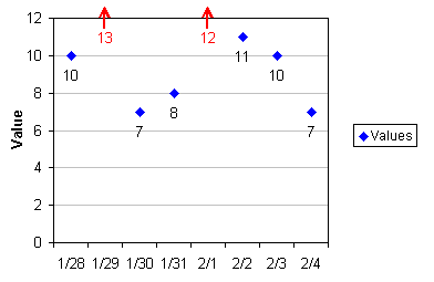
I would like to lock the vertical axis from 85% to 100% for better visibility of performance, but what do I do when I get a data point off the chart? In the attached picture, January was 64%.
I don't want to change the axis when I get an outlier because I want to keep the focus on the normal control range and have the axis consistent across all metrics. I don't want to manually add data labels every time I have an outlier.
I am thinking of some ugly options where I make the chart do what I want through formula magic and special chart data, etc., but I am looking for some fresh ideas before I sink the time into something like that.
Are there other control charts I should consider here that would be better? I was looking at statistical quality control charts (like p chart, x-bar chart) but I think they will be too confusing for my audience that like simple charts and 3 colors.
Thanks for any input!


