• Hi All

    Please note that at the Chandoo.org Forums there is Zero Tolerance to Spam

    Post Spam and you Will Be Deleted as a User

    Hui...

  • When starting a new post, to receive a quicker and more targeted answer, Please include a sample file in the initial post.

Dashboard Ideas

Rico Mawcinitt

New Member
Hello -

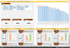
I am in need of some visual ideas. I am helping my wife with a dashboard to illustrate her schools performance by grade. I know that I am going to need two views, summary of entire grade, and then more specific data by grade/student. I have gone through a few revisions and would like some feedback and ideas of ways to present this info. I will be adding slicers at some point to look at data by teacher, gender, ethnicity, and category.
 

Attachments

  • Chandoo Upload.xlsx
    383.5 KB · Views: 46
Hi Rico

In your first chart your space is too small to be showing 69 items all with labels in a single chart. It is too messy and no information can can gleaned from your chart rendering it useless.

Show your chart at a higher level or take the names out so the chart shows a flavour rather than showing names. Maybe just chart the 69 Students, 65 approaching and 5 Passing in your chart. That would be more meaningful. if you have to chart all 69 then clearly you need a more visually appealing approach.

You have used 7 colours, pare that back to 3-4 colours and it will look a lot cleaner. Too busy with all those colours.

Any cell that is merged - get rid. You can make that dashboard in normal everyday Excel rows and columns. Merging cells does not add any value to this dashboard. You are using 23 columns and I think it is a 12 column job.

Anyways these are only my thoughts on your dashboard. Something to think about.

Take care

Smallman
 
I have made a lot of changes on the aesthetic based on your feedback. Take a look at this print screen of the new layout. What are your thoughts?
 

Attachments

  • Dashboard.PNG
    Dashboard.PNG
    97.9 KB · Views: 35
Hi Rico

Congratulations. That is a massive improvement in a short time. I like the look and feel of the dashboard. Well done!!!!

If I were going to change anything, the charts at the bottom of the page, I would make the colour scheme, blue, brown and yellow which is consistent with the 3 predominant colours used in the dash.

From a data cleansing perspective I would have a close look at your Blank categories. Maybe remove these or if important, change all the blanks in your source data and put 'No Response' or something similar.

You have 4 slicers which tells me the back end is run off pivot tables. I would love to see the raw data and replace the pivot tables with calculation tables. This is a minor point and tugs at my preference for calc tables over pivot tables in just about every situation. (mind these are my opinions and others will disagree). By creating calc tables you could have less slicers and use a mixture of other Excel controls.

I want to point out that the above points are minor and I really like the final result. Good work!!!


Take care

Smallman
 
Thank you once again for the quick reply and feedback. I have learned a lot just on this one project alone. I have updated the file as you are correct there are many pivot table involved. I am very intrigued on how calc tables could be used in place of all the pivots. This will be something I research in the very near future. I do find the slicers to be a limitation at times. My next phase of this is to improve the large chart in the top right section of the dashboard. I want to switch this to a scatter plot that has dynamic X and Y's that can be set to cell reference. I am guessing I might need to venture into some VBA to get this done. Any guidance there will be greatly appreciated as well.

Rico
 

Attachments

  • Chandoo Part 2.xlsx
    415.3 KB · Views: 44
First, you can set dynamic range references in your charts using formula..see the link below

http://chandoo.org/forum/threads/what-chart-to-use-for-multiple-data.22473/#post-136050

Note there are several ways to create dynamic charts, they may be or may not be of any use for you here in this case but just from the learning perspective

http://chandoo.org/wp/tag/dynamic-charts/

http://peltiertech.com/Excel/Charts/DynamicColumnChart1.html

Btw, you will find this link useful as well - http://www.thesmallman.com/

Second, Yes, I agree with Smallman in #5 where he talks about using calc tables over pivot tables, but again it is what I think others may not agree

I personally do not use much of pivot tables though it comes with some amazing features and the reason is that everytime there is any change in the data we are required to refresh it or change the ranges..so, a lot of excel users switch to calc tables and excel tables

So Smallman in his post is referring to avoid slices and use other controls – it is Form controls or ActiveX controls and these controls live in Developer tab on Excel Ribbon

If you do not see the developer tab on the ribbon

Click the File tab >> Click the Options at the left to enter into Excel Option window >> Click the Customize Ribbon at the left >> At the right, select the Main Tabs from Customize The Ribbon drop down box >> Check the Developer item >> Click the OK button to finish customizing

Since, I am running short of time right now, I am sharing one of the dashboard (though not so great) this should explain you how calc tables work. Go through the “calc” tab. In this dashboard I have used form controls and calc tables & excel tables.

http://www.exceltip.com/team-performance/team-performance-dashboard-by-asheesh-mattoo.html

If you need some more help, please don’t hesitate to ask
 
Hi ,

I would like to differ on the usage of pivot tables vis-a-vis calculated formulaic results.

Before the introduction of slicers , the choice would have been very easy ; pivot tables were too restrictive.

With the introduction of slicers , there has been a dramatic swing in favour of slicers ; these are because :

1. Slicers can be physically distanced from their pivot tables

2. Slicers are inherently interconnected ; if you have multiple slicers in a pivot table , making a selection in one slicer automatically changes the other slicers to reflect your selection. This is a wonderfully user-friendly way compared to the difficulties of implementing cascading dependent dropdowns.

It is of course incidental that slicers can be styled aesthetically.

Narayan
 
Back
Top