Hi,
I don't know why but I am having difficulty even getting started on this task.
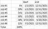
I was asked to chart an employee's planned work effort against the employee's actual work effort over an entire year. As an example, employee A states they have the following planned work effort. There are 40 hours in a week so 160 hours in a month:
Job 1: 5% of their weekly hours from January 1, 2021 - December 31, 2021
Job 2: 25% of their weekly hours from January 1, 2021 - December 31, 2021
Job 3: 15% of their weekly hours from January 1, 2021 - December 31, 2021
Job 4: 40% of their weekly hours from January 1, 2021 - December 31, 2021
Job 5: 15% of their weekly hours from January 1, 2021 - April 15, 2021
Job 6: 15% of their weekly hours from March 15, 2021 - September 28, 2021
During the period of March 15 - April 15 the employee has plans to work more than 100%
After September 28 the employee has plans to work less than 100% because the job ends.
It is possible another job is assigned to get the employee back to 100% or above
One of the goals is to determine when an employee does have less than 100%.
But, reality is often different than plans. So, actual work effort needs to be compared against the plan. As an example, the employee may have the following actual work effort:
Job 1: 6% of their weekly hours from January 1, 2021 - December 31, 2021
Job 2: 31% of their weekly hours from January 1, 2021 - December 31, 2021
Job 3: 15% of their weekly hours from January 1, 2021 - December 31, 2021
Job 4: 34% of their weekly hours from January 1, 2021 - December 31, 2021
Job 5: 14% of their weekly hours from January 1, 2021 - April 15, 2021
Job 6: 15% of their weekly hours from March 15, 2021 - September 28, 2021
The above needs to be shown in one chart. I have tried stacked column charts, clustered bar charts, and made my own GANTT charts. However, none of them show the data clearly, concisely, or correctly. I envision months on the X-axis, and jobs on the Y-axis with two horizontal data sets; planned & actual. But, when doing this I get a planned bar spanning January thru December, and an actual bar showing year to date work effort. But, it needs to show the percent for the month vs the actual. Hmmm...maybe I need to have a start & stop date for each month vs. the entire year. ...Hmmm Let me go try that but in the meantime if anyone can help I would appreciate it. Can anyone help get me unstuck?
Thank you.
I don't know why but I am having difficulty even getting started on this task.
I was asked to chart an employee's planned work effort against the employee's actual work effort over an entire year. As an example, employee A states they have the following planned work effort. There are 40 hours in a week so 160 hours in a month:
Job 1: 5% of their weekly hours from January 1, 2021 - December 31, 2021
Job 2: 25% of their weekly hours from January 1, 2021 - December 31, 2021
Job 3: 15% of their weekly hours from January 1, 2021 - December 31, 2021
Job 4: 40% of their weekly hours from January 1, 2021 - December 31, 2021
Job 5: 15% of their weekly hours from January 1, 2021 - April 15, 2021
Job 6: 15% of their weekly hours from March 15, 2021 - September 28, 2021
During the period of March 15 - April 15 the employee has plans to work more than 100%
After September 28 the employee has plans to work less than 100% because the job ends.
It is possible another job is assigned to get the employee back to 100% or above
One of the goals is to determine when an employee does have less than 100%.
But, reality is often different than plans. So, actual work effort needs to be compared against the plan. As an example, the employee may have the following actual work effort:
Job 1: 6% of their weekly hours from January 1, 2021 - December 31, 2021
Job 2: 31% of their weekly hours from January 1, 2021 - December 31, 2021
Job 3: 15% of their weekly hours from January 1, 2021 - December 31, 2021
Job 4: 34% of their weekly hours from January 1, 2021 - December 31, 2021
Job 5: 14% of their weekly hours from January 1, 2021 - April 15, 2021
Job 6: 15% of their weekly hours from March 15, 2021 - September 28, 2021
The above needs to be shown in one chart. I have tried stacked column charts, clustered bar charts, and made my own GANTT charts. However, none of them show the data clearly, concisely, or correctly. I envision months on the X-axis, and jobs on the Y-axis with two horizontal data sets; planned & actual. But, when doing this I get a planned bar spanning January thru December, and an actual bar showing year to date work effort. But, it needs to show the percent for the month vs the actual. Hmmm...maybe I need to have a start & stop date for each month vs. the entire year. ...Hmmm Let me go try that but in the meantime if anyone can help I would appreciate it. Can anyone help get me unstuck?
Thank you.
Last edited: