• Hi All

    Please note that at the Chandoo.org Forums there is Zero Tolerance to Spam

    Post Spam and you Will Be Deleted as a User

    Hui...

  • When starting a new post, to receive a quicker and more targeted answer, Please include a sample file in the initial post.

Bull's Eye Chart

summersinnantes

New Member
Hello,

I have spent hours Googling this but have got nowhere. I would like to create a bull's eye chart in Excel. The idea is three levels of concentric circles coming out from the central Bull's Eye. I would like to circle to be split into multiple segments (like a pizza). I would then plot data points into each concentric circle area of each segment.

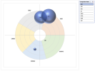
Below is an example of the type of result I'm looking for (this is from a specialist software not related to Excel).

Do you know if producing this is possible in Excel (or Sheets, Tableau, Google Looker, ...) ?
1723638272591.png
 
Thanks for your reply. I've no sample data as yet. I've been trying to understand if it was possible. I can put something together.
 
Many things could be possible,
but without a sample data which could give same kind of output as You've show
others should create that data
and it could be different than data, which You would like to use.
 
Please find attached some sample data and a poorly drawn example of what I am trying to achieve. Kind regards
 

Attachments

  • Bulls Eye Sample Data.xlsx
    843 KB · Views: 3
There should be more data for position of employees.
Ranking give distance but ... where in segment?
You could get an idea from this sample ...
 

Attachments

  • Bulls Eye Sample Data.xlsx
    656.4 KB · Views: 8
Hello. This is excellent! Thank you very much for your help. I understand that G,H and I determine the trajectory of the bubble on the radius. This works very well. How would I reverse the scale so that plots marked 4 in column D appear closer to the bull's eye in the centre? Kind regards
 
It was a quick sample and
there were some challenges - modified.

I added 'reverse'-option - You can get both.
left 'normal' - right 'reverse'
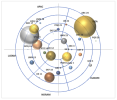
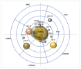
Screenshot 2024-08-15 at 11.56.34.pngScreenshot 2024-08-15 at 11.56.42.png
It's (very) sensitive.
It would need to do some settings that it would start to 'work' as You would like it 'work'.
Test it with basic values that You can see how do it work.

I added there option for random angle too.
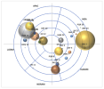
Screenshot 2024-08-15 at 11.56.54.png
 

Attachments

  • Bulls Eye Sample Data.xlsx
    27.7 KB · Views: 5
Thanks once again. The extra controls you've added are most useful. I think I'll need to abandon bubble size as a way of indicating the size of the company. It prevents me from seeing clearly which concentric band the competitor sits within. Also, I'll need to look at getting the labels closer to the bubbles as I can't always tell which label goes with which bubble. Overall I think you've done a great job. I did send a donation through as a thanks for all your support.
 
Thanks. That is clearer. I've started to add real data and I'm realising that I was too ambitious to try and put all 5 regions (Europe, Noram, etc) onto one single circle target. I think I need to create a dashboard approach that shows five circle targets; one for each region. I would however like to ensure that unique competitors are identified by the same colors across each regional circle. Do you know if this is possible?
 
Many things are possible ...
Do You need to see all five regions in one time?
... One idea would be that You'll select which region to see ...
Anyway, it would need VBA with colors - can You use those?
... if regions has various number of competitors ... it should take care too = testing, testing.
>>> You've to have more realistic sample layout - what do You really need?
OR
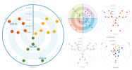
I tested with minor modifications and ... it looks like below
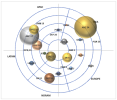
Screenshot 2024-08-16 at 17.09.03.png
Competitor Name can select right side.
Now, all are same color.
 

Attachments

  • Bulls Eye Sample Data.xlsx
    47 KB · Views: 3
Last edited:
Thanks. This is a very interesting approach that I hadn't considered. To answer your questions: yes, I do need to be able to see all regions at once. I think your approach could work but I need to find a way to better scale the bubbles (I think I'll rework the data to classify the companies by broad size rather than actual size e.g. start-up, SME, large, MNC - I can maybe assign a value to each of these categories to avoid the very large bubbles. I also need to be able to easily identify the same company in different regions (unique color for each bubble maybe). I like the filter you've added. Great idea for focusing in on a few companies. I'll pull together some better data and share it with you. Thanks once again for your support.
 
I did one more sample,
I see that You can smoothly find those features.
> For colors, it needs VBA
> > You can choose 'any colors' for those as in my file.
> > > need to click [ Button ]
>> for bubble size, there is possible to set it ( 0...300 )
>> for data, there are one possible way to do it ( from five to one with weights )
>> The layout ... has to be same as now ( VBA )!
 

Attachments

  • Bulls Eye Sample Data.xlsb
    69.9 KB · Views: 5
You have some great ideas. If I've understood correctly then columns E-I are used to rate the competitor on different weighted parameters with the result in column J determining its position relative to the bull's eye. And you've done something similar to size the number, which is a great idea. It really is very well done.
 
Back
Top