Clarence Perdue Jr.
Member
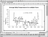
I am working on creating a Climate Warming Trend Graph of 20 yrs of Data. I am not sure how to display it visual to see the trends visually. The graph will have an Average Daily Air Temperature on the Y axis and the X will be the days. I have a sample of what scatter graph of how the data would look over a 365 day period. But, need to show this for 365 * 20 = 7300 days. I am not sure this is possible to be display on poster board of 40 inches by 30 inches. I attaching a picture of what single year look like. Do anyone have and ideal of how best to show this trend. Can this be done with Excel? Are there better visual ways to see the trend other than a smooth or scatter graph.