• Hi All

    Please note that at the Chandoo.org Forums there is Zero Tolerance to Spam

    Post Spam and you Will Be Deleted as a User

    Hui...

  • When starting a new post, to receive a quicker and more targeted answer, Please include a sample file in the initial post.

How To Modify This Formula To Change The Chart Bar Colours

Lim Aina

New Member
Hi guys,

So, I have found this formula that automatically changes chart colours depending on the original data cell colour. However, I am facing a problem when the original data cell colour is set to "no fill" the chart bar still comes out as a solid opeque "white". In my intended use, it is blocking my underlying text as I have made the chart box "transparent", but this bar is appearing as a opeque white block.

How do I modify this formula to ensure a "no fill" original cell colour is reflected in the chart accordingly? Thank you, appreciate the assistance!

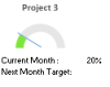
I would like to create a semi doughnut chart as the attached. Without the bottom 180 degrees set as "no fill" it will block my underlying text.

This is the formula I found online:

Sub ColourDoughnut()
Dim cht As ChartObject
Dim i As Integer
Dim vntValues As Variant
Dim s As String
Dim myseries As Series

For Each cht In ActiveSheet.ChartObjects
For Each myseries In cht.Chart.SeriesCollection

If myseries.ChartType <> xlDoughnut Then GoTo SkipNotDoughnut
s = Split(myseries.Formula, ",")(2)
vntValues = myseries.Values

For i = 1 To UBound(vntValues)
myseries.Points(i).Interior.Color = Range(s).Cells(i).Interior.Color
Next i
SkipNotDoughnut:
Next myseries
Next cht
End Sub
 

Attachments

  • Chandoo.PNG
    Chandoo.PNG
    2.1 KB · Views: 13
Hi Lim ,

What you have posted is not a formula , but a macro or VBA code.

If you can upload your workbook with data and the chart in it , and explain what exactly you wish to do , it may be possible to achieve this without the code that you have posted.

Narayan
 
Hi Narayan,

Thank you for your reply. Sorry my bad, yes its a macro.

Please refer to the attached. Please see Tab Scratchpad first and then Dashboard as I wrote up a note to explain there. I'm doing up a simple dashboard and would like to have the chart colours automatically reflected to whatever editing in Tabs 2 & 3 (tabs Planned Project List and Planned Initiative List).

The idea is to have users editing only in tabs Planned Project List and Planned Initiative List and all the necessary changes in the Dashboard be reflected automatically. The Scratchpad collects relevant data from tabs Planned Project Lists and Planned Initiative List to generate the Dashboard.

I have two issues:

1. Is there an automatic way to link the colour of a cell from tab Planned Project List and Planned Initiative to the Scratchpad?

2. The macro in my first post works well to automate the colour of the individual graph except that the 180 degree 'bar' would not turn to 'no fill'. Instead it comes up as a 'opaque white' which is blocking some details in the dashboard.

Please advise, thank you!
 

Attachments

  • Chandoo PMD.xlsm
    171.4 KB · Views: 12
Hi Lim ,

It's all very confusing for me. Let me try and understand in my own words.

1. On the Scratchpad tab , you have the cells N15 , N18 , N21 , N24 and N27 corresponding to the first 5 projects ; I assume these will be extended further for the other projects which are listed on the Planned Initiative List tab.

On the Planned Initiative List tab , the text Project 1 is entered in cell C4 , which is coloured a particular colour ; you want that cell N15 on the Scratchpad tab should be coloured this same colour ; is this correct ?

For Project 2 on the Planned Initiative List tab , the text Project 2 is entered in cell C49 , which is coloured a particular colour ; you want that cell N18 on the Scratchpad tab should be coloured this same colour ; is this correct ?

This same action should be taken for every project.

2. For the speedometer charts , you have displayed a legend at the bottom of the dashboard , indicating the colours for Planned , Active , Delayed , Stopped and Completed.

Is this legend only for the 2 big speedometers , or is it for all of them ?

3. Since the colouring of the speedometer charts is a one-time exercise , why do you want it done through a macro ? If you configure one speedometer chart the way you want it to be , you can copy the same chart as many times as you want , and then change the series to reflect the data.

Narayan
 
Hi Narayan,

Thank you for your reply. So sorry that this is super confusing.

1. Yes, correct.

2. These legends are for all charts and the whole dashboard. So, say a project in Planned Project List is Delayed, users will manually changed it to yellow in the Planned Project List tab (as per point 1. above) and the corresponding linked cell in Scratchpad will turn yellow too as a result from the user's one manual change in Planned Project List tab.

3. Unfortunately, at different points in time project status might change. Hence, users will manually change the colour as per no 2. above and I want to link that colour change to the Scratchpad and have the charts displayed in Dashboard also automatically changed to either grey, blue, green, yellow or red depending on the colour in Scratchpad which is automatic depending on the user's manual change in Planned Project List.

I hope this makes sense! The macro in my first post, automates the graph colour, however I can't seem to get the 'no fill' coloured bar to be no fill in colour. It keeps turning up at opeque white which then blocks my underlying text.

This is my first time look to macro for Excel and I'm so going to learn it up after this dashboard project cause it's just so amazing how much it can do, but I have absolutely no idea now how to even modify the above googled macro.

Thank you!
 
Hi Lim ,

I am still not convinced !

I have changed the macro slightly , so that it colours only the second point in each of the smaller doughnut charts.

Can you change the colours in the Scratchpad column D , and run the macro and see if the charts reflect the changes ?

If this works , then a second macro can be written to update the 2 big doughnut charts , since the number of points in these 2 are different from the number of points in all of the others.

Narayan
 

Attachments

  • Chandoo PMD.xlsm
    166.2 KB · Views: 13
Hi Narayan,

Thank you so much for your assistance! I have decided to just put a text box in front of the opeque white bars and rearrange so as the linked cells are not blocked by it.

Thank youuu! Still facing one more issue on hyperlinks that I have posted here if you could advise.

Thank you!
 
Hi Jina ,

See your file. The problem was that the chart was of type xl3DPie , and not xlPie.

Narayan
 

Attachments

  • PieChart Color match.xlsm
    18.8 KB · Views: 16
Wow, that make sense! Thank you very much. I don't know how to use the codes. So every time I make different chart, I need to change the type? Is that how it works? See also red font below.. another "xlPie" that you did not changed. Does it matter?

For Each cht In ActiveSheet.ChartObjects
For Each myseries In cht.Chart.SeriesCollection
If ((myseries.ChartType <> xlPie) And (myseries.ChartType <> xl3DPie)) Then GoTo SkipNotPies
s = Split(myseries.Formula, ",")(2)
vntValues = myseries.Values
 
Hi Jina ,

So every time I make different chart, I need to change the type

YES.

The original line of code was :

If myseries.ChartType <> xlPie Then GoTo SkipNotPies

What this was doing was that if your chart was not of type xlPie , it was exiting the loop. Since your chart was of type xl3DPie , it was not of type xlPie , and hence the code was not modifying your chart.

The above line has now been changed to :

If ((myseries.ChartType <> xlPie) And (myseries.ChartType <> xl3DPie)) Then GoTo SkipNotPies

Now , the code is checking to see if the chart is of any type other than xlPie and xl3DPie ; only if it is neither of these , the loop will be exited.

So now the code will work with a simple pie chart , as well as a 3D pie chart ; of course there are other types of pie chart such as an exploded pie chart ; if your chart is of this type , the code will not modify your chart.

The basic lesson to take away from this is that the code should be modified to suit the type of chart you want it to modify.

Narayan
 
Back
Top