I am sorry if i am not able to make you understand....plz find attached paint illistration.....for 2018 year we need 2 lines one for rofo and one is for AE....as all other years has only AE cost.....where as 2018 has only AE n Rofo 1 cost...Hope i am making sense...Thansk
You are using an out of date browser. It may not display this or other websites correctly.
You should upgrade or use an alternative browser.
You should upgrade or use an alternative browser.
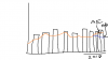
Quarter wise graph
- Thread starter Veeru106
- Start date
Chihiro
Excel Ninja
I still don't get you...
Travel also has ROFO & AE part, yet you don't indicate that.
As well, there's no convergence point for AE/ROFO.
From your description...

Travel also has ROFO & AE part, yet you don't indicate that.
As well, there's no convergence point for AE/ROFO.
From your description...
Code:
MktCost-AE = CALCULATE(SUM(Sheet1[Value]),FILTER(Sheet1,[AE/ROFO]="AE"&&[Costs Elements]="Mkt cost"))
Code:
MktCost-ROFO = CALCULATE(SUM(Sheet1[Value]),FILTER(Sheet1,[AE/ROFO]="Rofo 1"&&[Costs Elements]="Mkt cost"))
Code:
Travel = CALCULATE(SUM(Sheet1[Value]),Filter(Sheet1,Sheet1[Costs Elements]="Travel"))Chihiro
Excel Ninja
You could fake converging point by changing MktCost-ROFO to something like...
 .
.
But I wouldn't recommend it.
Code:
MktCost-ROFO =
IF (
    CALCULATE (
        SUM ( Sheet1[Value] ),
        FILTER ( Sheet1, [AE/ROFO] = "Rofo 1" && [Costs Elements] = "Mkt cost" )
    )
        = 0,
    CALCULATE (
        SUM ( Sheet1[Value] ),
        FILTER (
            Sheet1,
            [Date] >= DATE ( 2017, 10, 1 )
                && [AE/ROFO] = "AE"
                && [Costs Elements] = "Mkt cost"
        )
    ),
    CALCULATE (
        SUM ( Sheet1[Value] ),
        FILTER ( Sheet1, [AE/ROFO] = "Rofo 1" && [Costs Elements] = "Mkt cost" )
    )
)But I wouldn't recommend it.
")
Hi Chihiro,
This is regarding the same issue , we discussed like 1 month back…..if you remember you have helped me to prepare something on Power BI
And in course of this you have mentioned one formula (= Date.From([Attribute] & " 1," & Text.From([Year]))) .
I am using same kind of data here and when I used same formula as above it gives me syntax error.
Attaching the error msg in doc file. Can you please look at it and suggest what is wrong here.
Thanks for your time and efforts
Attachments
Thanks buddy…it is working fine.
Now my graph is shaping up, but facing other issue now.
While I am trying to show 2 elements in graph.
Where one element is in millions other one is in thousand. I tried to show 2 Y axis , but due to some reason it is not showing option to activate second Y axis.
Any idea how can we do it?
File attached
Thanks
Attachments
I got it.....line values are wrong....now i can see both Y axis...but it doesnt show much fluctuation in case of line bar.
How can i change 2nd y axis values....
Another thing...my line at 2018Q1 is at 75k and 2018Q2 is at 76k but still line is going down...not sure why...
File attached.
thanks
How can i change 2nd y axis values....
Another thing...my line at 2018Q1 is at 75k and 2018Q2 is at 76k but still line is going down...not sure why...
File attached.
thanks
Attachments
Hi Chihro,
Sorry for multiple post but final graph is not what I was expecting.
I am attaching sample file …this is exactly what I am working on.
AE= Actual exp
Q1=Q1 exp forecast
Q2= Q2 exp forecast
Q4= Q4 exp forecast.
What I am looking at , line n cluster graph and it should change if I select anything in variable.
Right now I have made 5 measures.
I have added one column for date as discussed above.
And my final elements in Visualization window looks like as I pasted in doc document.
Right now graph shows bars n lines only at total level , if I change something else like opening HC etc it goes blank.
Can you please suggest something here.
Thank you
Sorry for multiple post but final graph is not what I was expecting.
I am attaching sample file …this is exactly what I am working on.
AE= Actual exp
Q1=Q1 exp forecast
Q2= Q2 exp forecast
Q4= Q4 exp forecast.
What I am looking at , line n cluster graph and it should change if I select anything in variable.
Right now I have made 5 measures.
- Total cost from variable (Total Cost = CALCULATE(SUM(Data[Value]), FILTER(Data,Data[Variable] = "Total Cost"))
- Actual FTE from FTEs/Cost (AE FTE Total = CALCULATE(SUM(Data[Value]), FILTER(Data,Data[FTEs / Cost]="FTEs"),FILTER(Data,Data[AE/RO]="AE"))
- Same other 3 for Q1,Q4 n Q2.
I have added one column for date as discussed above.
And my final elements in Visualization window looks like as I pasted in doc document.
Right now graph shows bars n lines only at total level , if I change something else like opening HC etc it goes blank.
Can you please suggest something here.
Thank you
Attachments
Chihiro
Excel Ninja
Your second measure for AE FTE Total...
You want both AE & FTEs combined using or condition? Then you'd need to change your formula. Note that "||" signifies OR condition. You'd use "&&" for AND condition in Filter function.
AE FTE Total = CALCULATE(SUM(Data[Value]), FILTER(Data,Data[FTEs / Cost]="FTEs" || Data[AE/RO]="AE"))
Here's what it looks like using Value as Column Value, and each measure as line values.

Other than that, I'm not sure what you mean by Q1=Q1 exp forecast etc.
You want both AE & FTEs combined using or condition? Then you'd need to change your formula. Note that "||" signifies OR condition. You'd use "&&" for AND condition in Filter function.
AE FTE Total = CALCULATE(SUM(Data[Value]), FILTER(Data,Data[FTEs / Cost]="FTEs" || Data[AE/RO]="AE"))
Here's what it looks like using Value as Column Value, and each measure as line values.
Other than that, I'm not sure what you mean by Q1=Q1 exp forecast etc.
Thanks Chihiro for looking at it.
I tried to change my formula but it shows weird line graph
Q1,Q2 n Q4 only denotes forecast for that quarter nothing else, where as AE means actual
now after updating formula my graph line for Q2 is also starting from 2016 where as we don’t have any data for Q2 from 2016….all quarters data is for 2018 only
means Q2 line which is below line , should start from for 2018
I just relicate your formula to AE,Q1,Q2 n Q4 and then take these measures in lines value.
Attachments
Chihiro
Excel Ninja
only denotes forecast for that quarter nothing else,
.... right but what DAX formula do you use to get that? What are the criteria for that value?
I'll need to see your PBIX file, I'm not sure what you are doing. Upload to dropbox or some other file sharing site and share link here.
Chihiro
Excel Ninja
In looking at your data... you have each quarter assigned to all months...
Ex:Q4
Is this intended?
You'll need additional transformation steps if it isn't.
Edit: Looks like to me, you don't need Total Level, T&L & MLB rows in your data, as those are aggregated values from other rows. You may want to restructure your data before working with it in PowerBI (i.e. flatten it).
Last edited:
Chihiro
Excel Ninja
Not in the file you shared with me.

Edit: Oh wait you havent? Then you'd need to. Otherwise you can't perform decent analysis on the data. Well structured data is key to data analysis.
As well, remember that I know nothing of your need and you'll need to be crystal clear on what end result should be. Noting that I know very little to nothing of your business terms (acronyms in the table).
Chihiro
Excel Ninja
Yes, attribute is created. However, you also need to ensure data structure is conducive to analysis. Which it isn't right now.
For an example, you have 3 rows (total level, T & L, MLB) which are all aggregate of other rows. You'd not want that in data model as aggregation should be done using measures.
As well, as I have stated, you have Q4 ROFO for all months Jan-Dec. Which isn't correct. I assume ROFO stands for Rolling Forecast. Meaning you take moving window to base your forecast on (using fifo rule). Then table should be organized quite differently with preceding and forecast period before/after 12 month period. Or with ROFO on separate table.