Hi All,
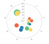
I have been trying to create a polar bubble chart (something similar to the one attached below. So far I have tried creating the background using a combination of donut and pie charts and then overlay a bubble chart with a transparent background. However, it is absolutely messy and painful every time I need to change the data, which is once a week.
I am sure there is a simpler way to get around it. Basically what I am trying to achieve is 3 to 5 concentric circles in the background representing very low to very high and then the circles to be broken in 3 to 7 quadrants representing sectors. The position of the bubble to show the level of risk relative to its sector and the quantum of the risk shown by the size of the bubble. I hope it is not too much to ask for in one chart
As suggested by vletm, i am attaching a small file showing the data i am trying to use to create this chart and an explanation of what each column of data represents
Attachments
Last edited:
