DashboardNovice
Member
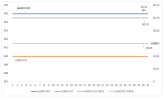
For this example, in the attached file I am concerned with only the following two data series/lines:
Short put (column F)
Short put price (column H)
Each strike price in column B has an associated option price in columns C and D. For this example I am using the BID prices in column C, because when you sell an option to open a trade, you sell at the bid price. See B22:C22.
1. User selects a strike price in K7. They can change the initial strike price to a different strike price if they want to.
2. The corresponding option price is displayed in L7 from a VLOOKUP
I am displaying the blue line called "Short Put" with the data label "Short Put" which is named after the name of that data series, but I also want to display the associated option price (L7) of $0.10 as a data label on the same line. There are two ways I can think of how to do this. I would prefer the first method if it is possible, otherwise I'll try the second method.
Method 1: I added a second data label which is currently displaying '495.' I would like to link this data label to cell L7. I know there is a data label option called 'Value From Cells' but I couldn't get that to work. So I would like to link the data label to L7 if possible.
Method 2: If the first method is not possible, the only other way I can think of how to do this would be to plot the gray line called 'Short Put Price', behind the blue line so that the blue line overlaps the gray line. I already have the data label for the gray line displayed. I added a secondary axis for the gray line but I can't get it so that it falls behind the blue line. Remember the user could change the strike price in K7 which would change the blue line, which in turn would change the gray line. So I'm trying to figure out how to get the gray line to always move with the blue line, whenever the blue line changes.