Emanuel Bernardes
New Member
Hello, Guys,
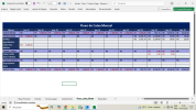
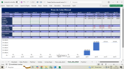
I've been working on creating a spreadsheet for cash flow control and I've been thinking about ways to make the spreadsheet more visual. I'd like to hear your opinions on this.
In the left column, I have the names of the information: sales, expenses, and the basics for controlling a small bakery business. Right below, I had the idea of putting a waterfall chart to give the person looking at it a better analysis. However, I'm not sure if it will really help or if it will just clutter the spreadsheet with unnecessary information.
The values are fictitious.
I welcome opinions on design (colors and table model).


