• Hi All

    Please note that at the Chandoo.org Forums there is Zero Tolerance to Spam

    Post Spam and you Will Be Deleted as a User

    Hui...

  • When starting a new post, to receive a quicker and more targeted answer, Please include a sample file in the initial post.

Monthly Slicer Problem in YTD Chart

Cristof

New Member
Hi,
I have a probably simple DAX (Power BI) problem.
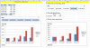
I have a simple matrix with sales per month and a DateTable.
I would like to show on one page a slicer with the months (1 to 12; from DateTable), a table showing the selected month sum of sales and the YTD some of sales, and a simple bar chart showing the sum of sales per month up to the month selected in the slicer.
My problem is for example, when I choose 4 (April) in the slicer, the bar chart only shows the April sum of sales, not the sales for January to March.
I am not sure, where the problem is? I suppose I need another measure to use in the bar chart, but I dont know how to "overwrite" the slicer selection but still keep to the maximum date from the slicer...
Can anyone help?
 
Isn't there a timeline slicer in powerBI?
If I'm not mistaken, in Excel you can select a month in the slicer, and if you press SHIFT, you select a range (e.g. Slice on March, but using shift it will select January-March). With CTRL you can select one by one. Might be PowerBI has the same behavior.
If that is not working, you may need to make a version of your measures that filters the value for all months YTM.
 
My problem is for example, when I choose 4 (April) in the slicer, the bar chart only shows the April sum of sales, not the sales for January to March.

I'm guessing that you are using straight SUM() for your measure and using slicer selection.

You can construct measure to check if slicer has one value selected. Then construct your measure based off of the selected value.

However, as GraH mentioned, using timeline slicer is much easier (it's downloadable as custom visual). Though I personally don't like how much real-estate is takes up.
 
Hi,
thanks for the Response.
If I try the timeline slicer in power bi, the effect, if I select months Jan-Apr. the bar Chart will Show the correct graph, but then, the table will Show the same values in the columns for monthly sales and YTD sales. And excat this is, what I dont want to have.
The bar Chart should Show the monthly YTD values, the table should Show in one column the selected month value and in the other column the YTD sales value.
I hope this additional explaination will help to Show my Problem.
 
Without sample not really. As DAX is highly contextualized in how it's evaluated.

I'd recommend mocking up sample of how you want it to look like in Excel (or even hand drawn). Then uploading sample data set. It will make it so much easier for us to help you.
 
Hello Chihiro,
ok, it is probably better to Show it with an example. I created it in Excel, but I want to do it in Power BI. (is is not working like this in Excel, I just made screenshots....)
62294
 

Attachments

  • 1566457305930.png
    1566457305930.png
    70.6 KB · Views: 0
Without underlying data structure, I can't help with DAX. Upload sample data set as requested (including any dimension tables).
 
Hello Chihiro,

sorry for my late answer.
Here a testfile. If I choose e.g. in the slicer Month 4, I would like to see in the table the sales for month No. 4 in one column and the YTD sales in the next column. The bar Chart should Show me the months Jan-Apr on the axis with it s sales per month and the YTD sales for every month until April. If I select in the slicher Month 1-4, I get the expected result in the bar Chart, but not in the table, therefore I think, the timeline slicer doesnt work here...

Hope this is cleas now, if not, please ask!
Thanks for your help in advance!!!
 

Attachments

  • testfile.zip
    53.2 KB · Views: 10
What you are after isn't really possible as is.

You could potentially do it via another table to force expanding single selection in the slicer to multiple months, using USERRELATIONSHIP and SWITCH function to tie it back to Sales table.

Alternately by creating tables for each month separately and using TREATAS and SWITCH... But again I'd not recommending this.

Instead as suggested previously use Timeline slicer. And use table or some other visual to display stat for max selected MonthNum.

Ex: Create measure as following.
Month = MAX(DimDate[MonthNum])
Month Total Selected = CALCULATE(SUM(Sales[Sales]), Filter(DimDate,[MonthNum]=[Month]))

Add these and Sales Total YTD to table.

Unfortunately there is no way to alternate between using DimDate[MonthNum] and the [Month] measure directly.

Ways to do it is to use two visuals that's flipped via some control, or using R visual.
 
Back
Top