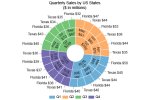
I am trying to make a excel graph that looks something like this. I tried by making doughnut chart, but not even close.
- Thread starter shubhamv85
- Start date

shubhamv85
Do You have sample data, which could give something like that?If so, then You should able to send it here.
shubhamv85
New Member
The data looks something like this.
shubhamv85
Do You have sample data, which could give something like that?
If so, then You should able to send it here.
Attachments
shubhamv85
Should I find any connection between Your snapshot and Your file?shubhamv85
New Member
No, there is no connection.
I just want the data in excel to be graphed as presented in snapshot. It just look like the snapshot.
Although it can be made just by placement of textboxes on a background, I was wondering if can be created in excel.
I just want the data in excel to be graphed as presented in snapshot. It just look like the snapshot.
Although it can be made just by placement of textboxes on a background, I was wondering if can be created in excel.
shubhamv85
... want ...... then Your sample file should have more similar than that original graph's data ... connection.
Did You try to check from that page - where did You take that ... snapshot?
or
Do You have clear image ...
... what/where is eg year ... like in the snapshot?
... or any data from Your file?

... and how those Your datas 'find' correct position in eg above graph?
Sarah John
New Member
Hello!
shubhamv85 If you're struggling to create a specific type of Excel graph, such as one that looks like a doughnut chart but isn't quite right, consider using ChartExpo. ChartExpo is an intuitive add-in for Excel that simplifies the process of creating advanced and visually appealing charts. It offers a wide range of chart types and customization options that can help you achieve the exact look you need for your data visualization.
shubhamv85 If you're struggling to create a specific type of Excel graph, such as one that looks like a doughnut chart but isn't quite right, consider using ChartExpo. ChartExpo is an intuitive add-in for Excel that simplifies the process of creating advanced and visually appealing charts. It offers a wide range of chart types and customization options that can help you achieve the exact look you need for your data visualization.
Attachments

shubhamv85
You're still thinking something ... why?Your Although it can be made just by placement of textboxes on a background, I was wondering if can be created in excel.
You wrote that You can do it manually ... okay ...
but with Excel or any other - You should able to tell
- how did You do it?
Your copied snapshot is like one quarter of doughnut chart
- same kind of output is possible to do, as I did with my sample snapshot.
OR
Have You tried to use Excel's SmartArt Design?
There could be something for You too.

Last edited: