
DashboardNovice
Member
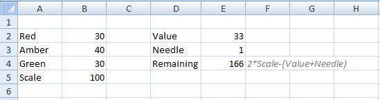
I am experimenting with a speedometer chart once more. I have a doughnut chart with values ranging from 0 thru 100 to form the upper half of the dial/gauge. I have created a pie chart with a needle showing in black. All other slices have been set to a transparent background fill.
I am having trouble trying to align the needle over the dial so that I get an accurate reading based on the actual value (dial value in K44 of the tab called 'Metric').
I just can't figure out the formula to determine exactly how to position the needle. I have tried using proportions of 180 and 360, but nothing is working.
1. Can anybody offer any suggestions?
2. Also, on the doughnut chart, notice how I have the values 0 - 100 displayed outside of the chart. To do this, I had to move each individual label. Is there an menu option that can do the same thing? The reason why I ask is because the alignment of each data label isn't perfect. I didn't see any options similar to what you see when using a pie chart.
Attachments
Last edited:
")
