Clarence Perdue Jr.
Member
The temperature is on column 30.
Yes, I see what you are saying about the information. Use column AM as the solid temperature.Hi Clarence ,
Column 42 is not correct ; can you say which is the correct column number containing data on average soil temperatures ?
Narayan
Hello Narayan,
Hello Narayan,
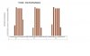
The graph result (Data Model -Discovery, Analyzing, Visualization) is very interesting. I need to understand the plateau and the low valley reading. I am trying to see if the Visualization can be shown in a different way from what is being shown. I may need to revisit the way that I worded the questions. In this problem, there is what is call First Frost Date and Last Frost Date. These dates maybe what really determine the actual growing season or period for a plant. I think that there may be an actual formula or program that let you see it from the data. I will do some more home work because I think that I saw a bar chart or table that showed those beginning date (First Frost Date) and ending date (Last Frost Date) for actual growing season. I will trying to get more understanding of this Growing Season Concept and see how the Average Temp and Average Soil temp are actually being used in determining this graph. This graph is really very impressive for me as I Analyze. But to a lay person(farmer etc.) who is not technical it may take a while to get what the graph is saying.
Hello Narayan,
Hello Narayan,Hi Clarence ,
I think the bar chart as you have shown it may confuse ; for instance in April 2000 , the bar is coloured till 14 ; I am sure you mean that the last frost day in the period Jan - June 2000 was on April 14 , in which case , the bar should be coloured from April 15 onwards ?
Wouldn't a line chart be more clear ?
Narayan