• Hi All

    Please note that at the Chandoo.org Forums there is Zero Tolerance to Spam

    Post Spam and you Will Be Deleted as a User

    Hui...

  • When starting a new post, to receive a quicker and more targeted answer, Please include a sample file in the initial post.

Power Pivot time aggregation & charting ?

Charter

New Member
Hello All,

I'm writing to ask how everyone else gets over this small issue that I'm having.....?

I have a bunch of data timestamped every five minutes and a calandar table with the timestamp which I use to extract a date and hour. Using this dataset I create a pivot table with data aggregated by avergae every hour which I then use to plot a chart of these averages over time - so far so good :)

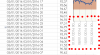
The simple problem I can't find a solution to is that the two date and hour columns that are used to order and aggregate the data into hours seem to get concactenated into a single label on the chart X axis as per the image attached - of course all I want to see is the date rather than the Date and Hour etc.

I'm guessing there must be a solution to this.... perhaps I'm not going about the hourly aggregation right or maybe there needs to be some VBA magic?

Hoping someone else has come across this problem and found a solution?

Thanks for any help.
 

Attachments

  • xaxis.PNG
    xaxis.PNG
    23.6 KB · Views: 5
Can you upload workbook with small sample? Just enough to demonstrate your issue.

Also, at which stage are you aggregating data into hourly? Is it done at PowerQuery stage or PowerPivot?

If in PowerPivot stage, are you using Date/Time dimension table? Or are you using calculated column?
 
Hi Chihiro,

I've attached a small sample which hopefully shows the issue. I'm aggregating in PowerPivot using a Calandar Table which has an column formatted to 'dd/MM/yyyy HH' so as to achieve the hourly aggregation.

Hopefully I've made a daft mistake :)
 

Attachments

  • TEST.zip
    712.3 KB · Views: 1
Ah, I see the issue. Hourly column used is actually text and not datatime format. Also, you should split time and date into separate columns.

You actually don't need calendar dimension table in this case. Since you don't have multiple related tables that need to share same dimension.

Just add following calculated columns to data table and summarize using that.

1. Date column: =INT([TIMESTAMP])
2. Hour column: =HOUR([TIMESTAMP])
 
Thanks for taking a look - I've updated the attached as suggested but I'm still getting the same problem with the chart not displaying the date along the X axis?
 

Attachments

  • TEST1.zip
    567.5 KB · Views: 1
Hmm, try changing Hour column formula to =TIME(HOUR([TIMESTAMP]),0,0)

And then enable multi-level category labels.

Unfortunately I can't edit your sheet as I have older PowerPivot (Excel 2010).

Edit: Just had a thought. Try creating Hourly column with following formula.
=INT([TIMESTAMP))+TIME(HOUR([TIMESTAMP]),0,0)

Then use that column as label and change number format to dd/mm/yyyy.
Adjust major/minor grid line and label frequency as needed.
 
Ah-ha.... now that edit worked nicely - thank you very much - phew..... of course one solution throws up another question! My data has continuous timestamps every 5 minutes but sometime there is no VALUE data associated with the timestamps (power cuts etc). As you can see from the attached image the date labels work fine until it comes across one of these gaps - is there a way to keep the time axis constant and simply miss out the missing data? - I know that in vanilla Excel selecting the axis as a Date Axis ensures the spacing is correct but this doesn't seem to work in this case?
 

Attachments

  • eg2.PNG
    eg2.PNG
    3.1 KB · Views: 4
My standalone Excel 2013 is acting up and can't test. But following should work.

Load Table to PowerQuery.
Add calculated column.
Houlry
Code:
=DateTime.From(#datetime(Date.Year([Timestamp]),Date.Month([Timestamp]),Date.Day([Timestamp]), Time.Hour([Timestamp]), 0, 0))

Then remove Timestamp column and group by "Houly", using avg of values to aggregate (name it "AvgVal" or something equivalent).

Then use following M to create custom function.
Code:
let CreateDateHourTable = (StartDate as datetime, EndDate as datetime, optional Culture as nullable text) as table =>
  let
    HourCount = Duration.Days(Duration.From(EndDate - StartDate))*24,
    Source = List.DateTimes(StartDate,HourCount,#duration(0,1,0,0)),
    TableFromList = Table.FromList(Source, Splitter.SplitByNothing()),
    ChangedType = Table.TransformColumnTypes(TableFromList,{{"Column1", type datetime}}),
    RenamedColumns = Table.RenameColumns(ChangedType,{{"Column1", "Hourly"}})
  in
    RenamedColumns
in
  CreateDateHourTable

To create custom M function. You'd add new blank query in PowerQuery editor and paste in the above. Then name it something like "funcCreateDateHour".

To use the function, invoke the function by entering start date & end date. Note that end date should be 1 day after last date.
upload_2017-3-27_16-6-32.png

It will create table named "Invoked Function" which has every hourly range from start date @ 0:00 to end date @ 23:00.

Now, merge Table1 into Invoked Function table with Left Outer Join, using Hourly columns as key.

Expand the resulting column for "AvgVal".
upload_2017-3-27_16-10-6.png

This will create table that you can load to data model and use as source for your pivottable.
upload_2017-3-27_16-11-33.png

NOTE: You may need to replace null value with 0.
 
Hi Chihiro, that's vey kind - thank you. This gives me a good excuse to dip my toe into Power Query....... I will learn for sure :) Cheers.
 
Back
Top