All articles with 'picture links' Tag
{ 15 Comments }
Image Lookup – How-to show dynamic picture in a cell [Excel Trick]
Published on Dec 16, 2020 in Learn Excel
![Image Lookup – How-to show dynamic picture in a cell [Excel Trick]](https://chandoo.org/wp/wp-content/uploads/2020/12/image-lookup-in-Excel-vlookup-but-for-images.jpg)
Do you ever want to have an image or picture lookup in Excel? Something like the depiction above.
In this article, learn how to set up an image lookup using Excel. You can use this to display staff details, product images or machine parts etc.
Continue »
Do you run an e-commerce website? You are going to love this simple, clear and easy website metrics dashboard. You can track 15 metrics (KPIs) and visualize their performance. The best part, it takes no more than 15 minutes to setup and use. Here is a preview of the dashboard.
Click to download the template.
Continue »
Ok people. Let me tell you that this post is almost not about Excel. It is about how one Excel blogger’s (yours truly) dream of long distance cycling came true. So sit back, grab your favorite drink and read between sips.
So what is this all about?
Last Sunday (27th July) & Monday (28th), I finished my first ever 200KM bicycle ride. I rode for a little more than 12 hours, burned 5,179 calories & rode 206 kilometers.
It is definitely one of the most memorable, tiresome & uplifting experiences in my life. So naturally, I want to share the story with you.
Continue »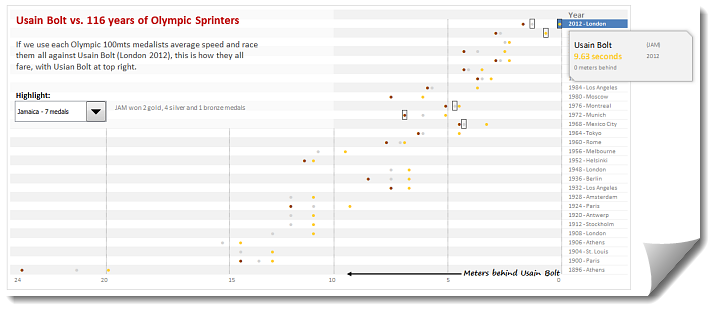
During London 2012 Olympics, Usain Bolt reached the 100mts finish line faster than anyone in just 9.63 seconds. Most of us would be still reading this paragraph before Mr. Bolt finished the race.
To put this in perspective, NY Times created a highly entertaining interactive visualization. Go ahead and check it out. I am sure you will love it.
So I wanted to create something similar in Excel. And here is what I came up with.
Continue »
