All articles with 'formatting' Tag

WordArt is a quick and easy to use tool to allow Excel users to add pizzazz to the presentation of your worksheets.
This is a quick tutorial in the use of WordArt.
{ 35 Comments }
Formatting Multiple Worksheets? Use Group Sheets option to Speed up [Quick Tip]
Published on Nov 15, 2010 in Learn Excel
![Formatting Multiple Worksheets? Use Group Sheets option to Speed up [Quick Tip]](https://cache.chandoo.org/images/qts/group-sheets-and-format.gif)
Often we come across workbooks that have similar formatting needs for multiple worksheets. For eg. you may have sales records spanning across 12 worksheets, one for each month. Now as a loyal reader of chandoo.org, you want to keep the formatting of all these worksheets consistent. So here is a quick tip to begin your work week.
Continue »{ 0 Comments }
Excel School Closing in a Few Hours – Join Now!
Published on Jun 21, 2010 in Learn Excel, products

As you may know, I run an online excel training program, called as, Excel School. I have opened registrations for 2nd batch of this program on last Monday. Thank you very much for supporting this program wildly. In a few hours, I will be closing the registrations for Excel School.
Click here to sign up for Excel School
At the time of writing this post (around 9 AM IST on 21st), we have 103 students signed up for Excel School. This is certainly a bit more than what I expected. But, I am also confident and eager to help as many of you as possible. So go ahead and join the program, because, you want to be awesome.
Continue »{ 20 Comments }
Adding Calculated Fields to Pivot Table P&L [part 3 of 6]
Published on Feb 25, 2010 in Learn Excel, Pivot Tables & Charts
![Adding Calculated Fields to Pivot Table P&L [part 3 of 6]](https://chandoo.org/img/ea/profit-loss-report-with-calculated-fields.png)
This is part 3 of 6 on Profit & Loss Reporting using Excel series, written by Yogesh Data sheet structure for Preparing P&L using Pivot Tables Preparing Pivot Table P&L using Data sheet Adding Calculated Fields to Pivot Table P&L Exploring Pivot Table P&L Reports Quarterly and Half yearly Profit Loss Reports in Excel Budget […]
Continue »
Today I want to introduce Excel 2010 to you. Excel 2010 is the latest version of spreadsheet software from Microsoft, set to be released for sale in late 2010. On Nov 18th, MS released the public beta of Excel 2010 [download here] along with other Office productivity software.
Excel 2010 has several improvements compared to earlier version – Excel 2007. In this post, I want to highlight some of the User Interface improvements made in Excel 2010 that are very exciting and fun to use.
Continue »{ 25 Comments }
Recipe for a Donut Bar Chart
Published on Sep 30, 2009 in Charts and Graphs, Learn Excel
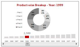
We all know that bar charts can be used to display values spread across various categories or times and pie charts / donut charts can be used to display percentage breakup of various quantities in a sum total. How about mashing up both to create a Donut Bar chart?
In this tutorial, you can learn how to make a donut bar chart and linking it to a form control to display Product-wise sales breakups spread across several years.
Continue »{ 28 Comments }
Pimp your comment boxes [because it is Friday]
Published on Sep 11, 2009 in VBA Macros
![Pimp your comment boxes [because it is Friday]](https://chandoo.org/img/l/better-comment-box.png)
Excel comment boxes are a very useful feature, but the comment box look hasn’t changed since slice bread. So Tom, one of our readers, took it upon himself to revamp the comment box. He wrote a simple macro to botox, smoothen and color the comment box. It is a fun and simple macro, something that can make a boring spreadsheet friday a little more exciting.
Continue »{ 9 Comments }
50 Best Cities for Finding a Job [Incell Dashboard using Excel]
Published on Aug 20, 2009 in Charts and Graphs, Learn Excel
![50 Best Cities for Finding a Job [Incell Dashboard using Excel]](https://chandoo.org/wp/wp-content/uploads/2009/08/incell-comparison-charts.png)
We all know that incell charts are a very cool way to explore and visualize data. Personally I like them so much that I have written several tutorials on it here. Today we will see how a Job dashboard on “50 best cities for finding a job” originally prepared by Indeed job search engine can be recreated in Excel using In-cell charts. The final outcome is something like this.
Continue »{ 0 Comments }
Are you focusing on F word or S word? [Charting Principles]
Published on Jun 17, 2009 in Charts and Graphs
When you are making a chart next time, spend just 5 minutes (or even less) on the formatting and give more time (may be 20 minutes) to think about the story.
Continue »{ 42 Comments }
Do you know these Excel 2007 Productivity Secrets (Hint: Coffee is not one of them)
Published on May 26, 2009 in Excel Howtos, Learn Excel
Do you know these excel 2007 productivity secrets? (1) How to turn on the clipboard pane so that you can do rapid copy pasting (2) How to lock a feature for repeated use (3) How to copy charts as pictures (4) How to features not on ribbon to the quick access tool bar (5) How to change the default file save settings so that excel always save files in earlier version and much more. Go ahead and read the secrets and become excel guru.
Continue »
That is right. Next week is your week on this blog. I will post content that is shared by you. So go ahead and share your tips and tricks with us. Read more to find out how you can share your tips with the community.
Continue »{ 36 Comments }
5 Areas where Mouse Kicks Keyboard’s Butt
Published on Mar 2, 2009 in Featured, Learn Excel

We are a big advocate of keyboard shortcuts. I think learning a handful of keyboard shortcuts can improve your productivity tremendously, whether you are using excel or firefox.
But using only keyboard shortcuts is like using only right hand. So, we have compiled 5 incredible ways mouse can help you be productive while using MS Excel.
Continue »{ 2 Comments }
How to Change Shapes in Microsoft Office 2007
Published on Feb 25, 2009 in Excel Howtos, Office Tips

Ever since we made a switch to Microsoft Office 2007 at work, this has been bothering me.”How to change one shape to another?”
This is very useful feature, especially when you are using PowerPoint.
Continue »{ 4 Comments }
[Weekend Poll] How do you Sex up your Charts?
Published on Jan 30, 2009 in Charts and Graphs, Learn Excel
![[Weekend Poll] How do you Sex up your Charts?](https://chandoo.org/img/a/your-fav-chart-format.png)
This weekend, let us talk … umm… charts. I want to know if you absolutely make sure your charts look good every time you sent them out to someone. I do this most of the time.
How do you sex up your charts?
Continue »{ 32 Comments }
Colors in Chart Labels [Quick Tip]
Published on Jan 29, 2009 in Charts and Graphs, Learn Excel
![Colors in Chart Labels [Quick Tip]](https://chandoo.org/img/a/chart-label-formatting-trick.png)
A simple label formatting hack can improve the effectiveness of YoY change charts by adding color to differentiate positive vs. negative growth (or mediocre vs. sky rocketing growth rates). See this example:
Continue »
