All articles in 'Featured' Category
Tomorrow is thanksgiving day here. It is a harvest festival on which people express thanks for what they have. Much like Sankranthi (pongal) in India. At this moment I am very angry and frustrated about the terror strikes in Mumbai. I am not sure how a person can do something like this to others. I […]
Continue »
Yesterday I have learned this cool excel charting trick and I cant wait to share it with you all. The problem: I have too many charts & want to show one based on selection You have made 3 charts to show your company performance in the last 8 years. But you don’t want to clutter […]
Continue »
By now everyone and their grandmother must have known about how Republican National Committee has spent $ 150,000 on Sarah Palin’s clothing and make up. I am a big fan of clothes. So much that I wear them everyday. But not all of us have a committee or fund raisers to dress up ourselves, none […]
Continue »
Sorting text is such a day to day activity that it always surprises me why Excel hasn’t provided a simple spreadsheet formula for doing it. Of course you can use the sorting menu command (menu > data > sort) but this requires manual steps (or VBA). Most of the times we get raw textual data […]
Continue »
It all began with my Excel Dashboard Tutorial – Making a dashboard with player statistics. I have used bar charts with axis whose minimum is not zero, to create a dramatic effect in the charts. See below: Jon Peltier commented saying that, Rule #1: Bar and column chart value axes should start at zero. Since […]
Continue »{ 32 Comments }
15 MS Excel Tips to Make you a Productivity Guru
Published on Oct 16, 2008 in Featured, Learn Excel
We all like to customize things, to personalize them so that we feel better, faster and smarter using them. Microsoft Excel is a perfect example of highly customizable software. It is simple to learn and use, and at the same time it is relatively easy to change the way it works for you. Here is […]
Continue »{ 21 Comments }
Red vs. Blue – 35 Cool Visualizations on 2008 US Presidential Election
Published on Oct 7, 2008 in america, Charts and Graphs, Cool Infographics & Data Visualizations, Featured
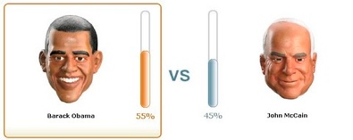
With 2008 US Presidential elections around the corner everyone is busy including chart makers. There are hundreds of excellent visualizations on the presidential election campaign, speeches, issues, predictions that keeping track of what is best can be a tough task. We at PHD have compiled a list of 35 totally awesome visualizations on the 2008 […]
Continue »The new Microsoft “Hi, I am PC” ads are supercool. Apple has been making fun of PC (and PC users) for while with the “I am PC, I am Mac” ads and the response from MS advertising team is nothing short of brilliant. With these simple & funny ads, they have changed the focus from […]
Continue »![Excel KPI Dashboards – Adding Micro Charts [Part 4 of 6]](https://chandoo.org/wp/wp-content/uploads/2008/09/kpi-dashboard-excel-thumb.jpg)
This is 4th part of Creating Management Dashboards in Microsoft Excel 6 post series by Robert. This 6 Part Tutorial on Management Dashboards Teaches YOU: Creating a Scrollable List View in Dashboard Add Ability to Sort on Any KPI to the Dashboard Highlight KPIs Based on Percentile Add Microcharts to KPI Dashboards Compare 2 KPIs […]
Continue »
With each passing day the amount of information contained in a single spreadsheet, slide, document is growing. Thanks to demanding bosses, clients and colleagues, we are now supposed to provide all the relevant information in as much less space as possible. This is where micro charting or light weight data exploration has become a rage. […]
Continue »![KPI Dashboards – Highlight KPIs Based on Percentile [Part 3 or 6]](https://chandoo.org/wp/wp-content/uploads/2008/09/kpi-dashboard-3-thumb.jpg)
Creating KPI Dashboards in Microsoft Excel is a series of 6 posts by Robert from Munich, Germany. This 6 Part Tutorial on KPI Dashboards Teaches YOU: Creating a Scrollable List View in Dashboard Add Ability to Sort on Any KPI to the Dashboard Highlight KPIs Based on Percentile Add Microcharts to KPI Dashboards Compare 2 […]
Continue »
Often it is easy to get carried away with a tools features. Excel is no exception. But here is a list of grotesque charts that you should never make, not even on your last day at work. 1. Leave the radar charts for Spidermen why? You can hardly conclude anything by looking at them They […]
Continue »Creating KPI Dashboards in Microsoft Excel is a series of 6 posts by Robert from Munich, Germany. This 6 Part Tutorial on KPI Dashboards Teaches YOU: Creating a Scrollable List View in Dashboard Add Ability to Sort on Any KPI to the Dashboard Highlight KPIs Based on Percentile Add Microcharts to KPI Dashboards Compare 2 […]
Continue »![Creating KPI Dashboards in Microsoft Excel [Part 1 of 6]](https://chandoo.org/wp/wp-content/uploads/2008/08/kpi-dashboard-scroll-excel-thumb.png)
Creating KPI Dashboards in Microsoft Excel is a series of 6 posts by Robert. This 6 Part Tutorial on KPI Dashboards Teaches YOU: Creating a Scrollable List View in Dashboard Add Ability to Sort on Any KPI to the Dashboard Highlight KPIs Based on Percentile Add Microcharts to KPI Dashboards Compare 2 KPIs in the […]
Continue »![Polar clock using donut chart [Excel Visualization fun]](https://chandoo.org/wp/wp-content/uploads/2008/08/donut-clock-in-excel-thumb.png)
Smashing Magazine is one of daily hangouts for new design ideas, inspiration and ogle fun. When they featured Pixel Breaker’s Polar clock last Friday on Top 10 creative ways to display time, I knew this could be an interesting visualization to do in excel. So I have created a donut chart in excel that can […]
Continue »
