
Win Loss Charts are an interesting way to show a range of outcomes. Lets say, you have data like this:
win, win, win, loss, loss, win, win, loss, loss, win
The Win Loss chart would look like this:

Today, we will learn, how to create Win Loss Charts in Excel.
We will learn how to create Win Loss charts using Conditional Formatting and using Incell Charts.
Win Loss Charts in Excel using Conditional Formatting:
Step 1: Create a helper column where we show cumulative totals
This is easy. Just show cumulative sum of numbers like this:
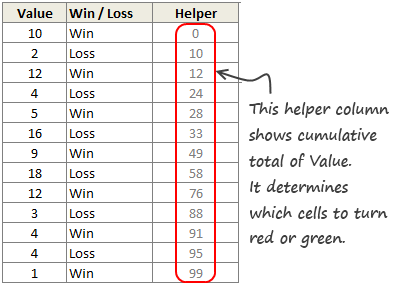
Lets say this is in D4:D16
Step 2: Create a 100 cell grid
Type numbers 1 thru 100 in one hundred adjacent cells, one each in a column.
Then resize this grid so that you can fit everything in a screen.
Lets say, this is in F3:DA3
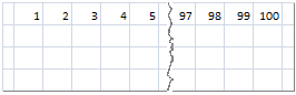
Assumption: I assumed that the total number of wins and losses we have is 100. If you have more, adjust accordingly.
Step 3: Fetch the Win or Loss Status for Each of the 100 Cells
This is a bit tricky, but easy once you figure out the formula. We will use INDEX+MATCH.
For each column, we will lookup the corresponding number in our cumulative total table and once we find a match (not exact match, but a number less than what we are looking for), we just return the corresponding win or loss value.
We will write this formulas in the range F4:DA4,
This formula will do: =INDEX($C$4:$C$16,MATCH(F$3,$D$4:$D$16,1))
How this formula works?
1. We are looking for a column number (F3) in the range of cumulative totals (D4:D16) for a less than match (1)
2. Once found, we want the corresponding element from C4:C16 (where the win – loss labels are maintained).
Step 4: Copy the cells F4:DA4 and paste them as links in F5:DA5
Step 5: Apply conditional formatting
Now, we just apply conditional formatting to cells F4:DA4 such that whenever the cell is “Win”, we fill it with Green color.
Similarly, we apply CF to F5:DA5 such that whenever the cell is “Loss”, we fill it with Red color.

Finally, hide the cell values in F4:DA5 by using custom cell format code ;;;
Related: How to Apply Conditional Formatting
That is all. Your Win Loss Chart is ready.

In-cell Win-Loss Charts in Excel:
We can create a slightly less accurate win-loss charts in Excel using In-cell charting approach.
See this illustration to understand the technique.

Follow this procedure:
- Create 2 helper columns – H1 & H2.
- In H1, print the | symbol for Win and print spaces (” “) for loss. When printing spaces, divide the value by x.
- “x” will depend on the font & font size you choose. For script font, 11 pt size, it is 2.2
- In H2, do the same for Loss.
- Now concatenate all H1 values and print somewhere.
- In the cell beneath, concatenate and print all the H2 values.
- Change color of above cell to Green and below cell to Red.
- Your in-cell win-loss chart is ready!
Bonus: Create Quick Win Loss Charts with Excel 2010
In Excel 2010, Microsoft introduced Win-loss charts. So, now you can easily create a win-loss chart. To do this, just select the binary data (1 for win, -1 for loss) and go to Insert > Sparklines > Win/loss chart

For more info: Visit Introduction to Excel 2010 Sparklines
Download Win Loss Chart Excel Template
I have made an excel template that creates win loss charts using conditional formatting and in-cell charts.
Go ahead and download the excel workbook [Excel 2003 version here]
Play with it to understand how to make win loss charts.
Do you use Win Loss Charts?
Personally, I never had to use win loss charts. But I have seen various applications of this chart. Win loss charts are effective in visualizing results from sports, stock markets and other such areas.
What about you? Have you used win loss charts before? How did you make them? Please share your techniques and ideas using comments.
More Excel Charting Tutorials:
- How to make a 5 star chart like Amazon.com
- Use Analytical Charts to make your boss love you!
- Interactive Chart in Excel to Show Effect of Grammy on Music Album Sales
- Dynamically Show or Hide Chart Series to give your viewers Control
- What are panel charts & How to use them in Excel?
- More Charting Tutorials, Templates & Examples
- Learn how to create, format & customize both simple and advanced charts by joining Excel School program.


15 Responses to “How to create a Win-Loss Chart in Excel? [Tutorial & Template]”
Hi Chandoo -
I LOVE this site.
We use win/loss sparklines a lot. I work for a retailer, and we constantly compare sales by store, year over year. We calculate the percent up or down, but it's easier to find trends using the win/loss sparkline.
I've played with different text versions of this using rept/conditional formatting as your example. Good technique, but the chart is still pretty meh.
The text way of doing it as above works really well, but if I'm going to actually put it somewhere, I'd use camera mode.
Incidentally, the fastest way to do this would be using SFE, just reflect your data with 1 for a win, - 1 for a loss. There's even an option to automatically invert negative numbers.
Chandoo-
I'm a little confused on the helper cell, and, where you came up with this data. It says a "cumulative sum"...but of what?
Would it be possible for you to do a lesson on the value of helper columns? I don't quite understand how they fit in, and, they probably could solve a lot of my current limitations. So....what is a helper column, how do you use it, when would you use it, and, maybe some basic examples?
Thanks!
3G
Here's an example of another technique which uses dynamic ranges and the method @dan I mentioned above (1=win, -1=loss; invert negative numbers):
https://docs.google.com/uc?id=0B4NW2k5VCmymZGM2MTlhNGYtMDBmNi00MWQ5LTkwZDAtOTcxYzE5YmE2NjVm&export=download&authkey=CJG5z-gP&hl=en_US
Very interesting on the graphical presentation! 😉
From my work experience, if there is anything related to do W/L analysis, the company would
1. treat Loss as a negative value
2. Loss value would hurt the accumulative amount. So if cumulated trending falls below zero, sales will have to find a way to make up the difference in the remaining months of the current fiscal year (or years over a 3-year trend over the same customer, or geographic area)
Hi Chandoo,
Very interesting to see this chart, just one quick query.. can we have some sort of marker in place so that it can differentiate between win/loss events.. what i mean is if we have 2 consecutive wins than we cant see from chart that how much they individually stands.. the whole portion of two events turn green.
I tried to plot a Stacked Bar Chart but looks kind of shady... any idea tbat can change charts life ? 🙂
Cheers
Rohit1409
@Rohit
You could edit the Conditional Formatting Format and apply a Vertical Line to the Right Hand side of the Cell.
.
It works, But looks a bit messy in my opinion
@Dan, Rohit and all: we can easily create a win-loss chart from a series of win / loss values too. See this for more: http://chandoo.org/img/c/win-loss-new.xlsx
The output will be like this:
This is the same technique as Josh in (4).
@Josh.. thanks for sharing your work. Here is your donut 🙂
@3G: The helper column shows cumulative sum of all the win / loss values up to that point. If you examine the formula, you will understand this.
I see it now Chandoo!!!! THank you so much!!! Makes sense. ha!
Hi Chandoo
i learnt the use of Rept function from your blog some time back. All these days i was showing the sparklines(with rept function) horizontally. Today i had a requirement wherein i was needed to show it vertically and solution is..use the Rept function as it is, later select the cell- Format-Alignment- make text alignment 90. this should solve the problem..hope this has not been discussed here..might be useful for Dashboard Developers.
Prasad:
http://chandoo.org/wp/2008/07/15/incell-bar-charts-revisited/
[...] week, we learned how to create win-loss charts in Excel. In the comments, Dan said, Incidentally, the fastest way to do this would be using SFE, just [...]
Hi to all, the contents existing at this web site are in fact amazing for people experience, well,
keep up the nice work fellows.
To improve the chart , in the rep("|", Number ) ,instead off "|" you may use "alt+249" you will get a wide bar as a character. and contious bar. ( you can cloure it too.)
I'm trying to create a formula that tallies losses that are in the format 120-80. If I use the formula =RIGHT(A2,(FIND("-",A2)-2)), it correctly returns 80. However, if the wins or losses are a different number of digits (e.g. 95-80 or 113-107), it doesn't work correctly. Any idea on how to account for varying numbers of digits in either the win or loss columns? Thanks in advance for any help.