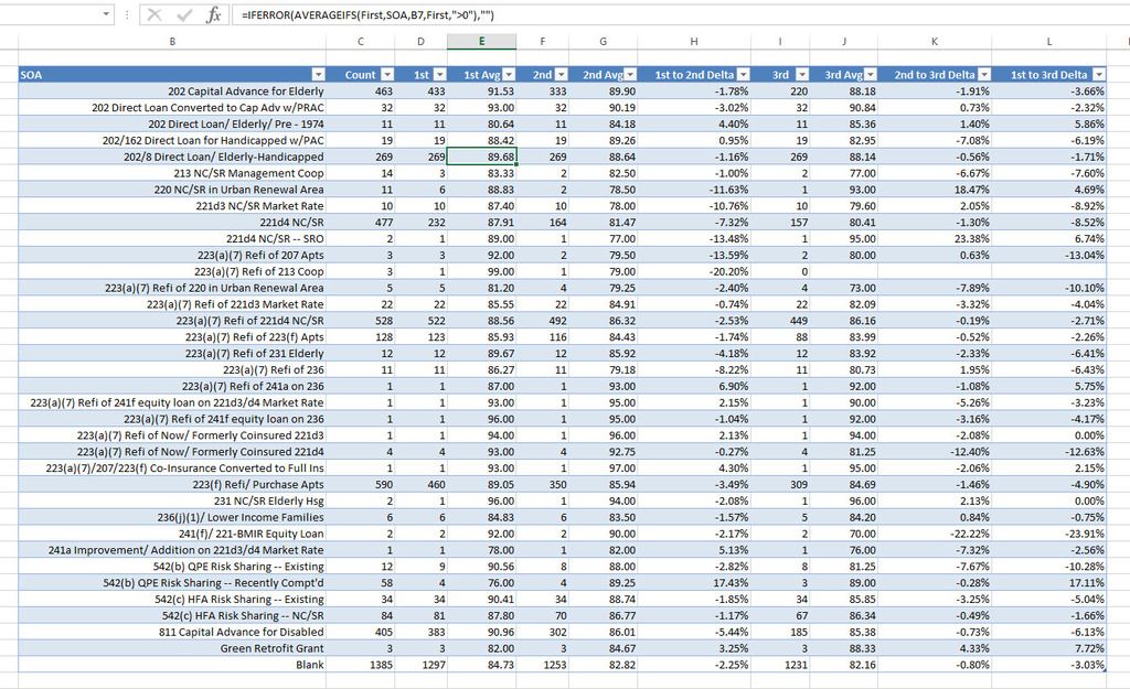
Chandoo friends, I could really use your help if you are out there! I have attached a spreadsheet that contains inspection scores for apartment complexes within various states. There are many variables like property city, state, category, Section of the Act (SOA), etc. The three most important columns are shaded in yellow, blue, and pink. These represent the most recent inspection score (yellow), 2nd inspection score (blue), and 3rd inspection score (pink), respectively. I have also included a column that calculates the percentage difference between the 1st and 2nd score and one for the percentage difference between the 1st and 3rd score.
Here's what I need: I'm trying to create a chart (or charts) that analyzes trends among the inspection scores. I want to see if I can find a pattern between properties with low scores. For example, is there a way to visualize any correlations between property SOA and a low score?
I appreciate any assistance you can offer. Take a look at my spreadsheet and feel free to play around or send me an example. Thank you!!

