Hello,
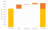
I want to visualize what a market looked like at two points in time, showing how subsections of the market has changed between the two time periods. The chart I've attached shows this but I think having 2022 and 2023 supply as separate bars means a lot wasted ink (double counting). We could simply label the new growth section with the constituent parts but that seems messy/ inefficient. Showing the extent of the growth in the context of the existing market is important so just visualizing the areas of growth doesn't work. Does anyone have any suggestions/ feedback?
I want to visualize what a market looked like at two points in time, showing how subsections of the market has changed between the two time periods. The chart I've attached shows this but I think having 2022 and 2023 supply as separate bars means a lot wasted ink (double counting). We could simply label the new growth section with the constituent parts but that seems messy/ inefficient. Showing the extent of the growth in the context of the existing market is important so just visualizing the areas of growth doesn't work. Does anyone have any suggestions/ feedback?