All articles with 'tweetboard' Tag
{ 29 Comments }
Customer Service Dashboard using Excel [Dashword Week]
Published on Mar 22, 2011 in Charts and Graphs
![Customer Service Dashboard using Excel [Dashword Week]](https://img.chandoo.org/dashboards/dw/customer-service-dashboard-excel.png)
Early in Jan, I got this mail from Mara, a student in Excel School first batch.
Hi Chandoo,
I took your first Excel batch class and loved it. I created a dynamic and interactive dashboard for my work. My boss thinks it’s an excellent tool and I have you to thank for and also Francis Chin who shared his travel dynamic dashboard. I integrated things you taught so thanks so much!
I felt very proud reading her email, so I asked her if she can share the dashboard with some dummy data so that we all can learn from her example.
Being a lovely person Mara is, she gladly emailed me the workbook and I am thrilled to include it in Dashboard Week.
Continue »{ 39 Comments }
How Francis Landed on Chandoo.org, Become Awesome and Made a Superb Dashboard, all in ONE Weekend
As part of our Reader Awesomeness Week, Francis shares with us a travel site dashboard he made for his company. Francis took just two days to prepare this awesome dashboard which uses concepts like bullet charts, sortable KPI grid, Date based filtering, dynamic charts and more. I was really moved by Francis’ gesture in sharing his work with us, so much that, I did a video review of his work. You can see it in the embedded youtube video to the left.
Read the rest of the article to know how this dashboard is made and get a copy of the file.
Continue »{ 18 Comments }
Best Charts to Compare Actual Values with Targets – What is your take?
Published on Dec 18, 2009 in Charts and Graphs, Featured
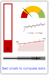
Comparing values is one of the main reasons we make charts. Yesterday we have a post on using thermometer charts to quickly compare actual values with targets. Today we follow up the post with 10 charting ideas you can use to compare actual values with targets. Check out how bullet charts, thermometer charts, traffic lights, gauges, column charts, area charts can help you compare targets with actual performances. A review of best charting options when you need to compare.
Read the rest of the post to see the options and participate in poll.
Continue »{ 18 Comments }
Tweetboards – Alternative to traditional management dashboards
Published on May 7, 2009 in Charts and Graphs, Featured
Here is a fun, simple and different alternative to traditional dashboards. Introducing….

