All articles with 'stock charts' Tag
{ 6 Comments }
Shading an area chart with different colors for up & down movements [case study]
Published on Jul 29, 2015 in Charts and Graphs
![Shading an area chart with different colors for up & down movements [case study]](https://chandoo.org/wp/wp-content/uploads/2015/07/indian-stock-market-chart.png)
We all know that area charts are great for understanding how a list of values have changed over time. Today, let’s learn how to create an area chart that shows different colors for upward & downward movements.
The inspiration for this came from a recent chart published in Wall Street Journal about Chinese stock markets.
We will try to create a similar chart using Excel. We are going to create the above chart in Excel.
Looks interesting? Read on…
Continue »{ 18 Comments }
Use Advances vs. Declines chart to understand change in values
Published on Feb 21, 2013 in Charts and Graphs
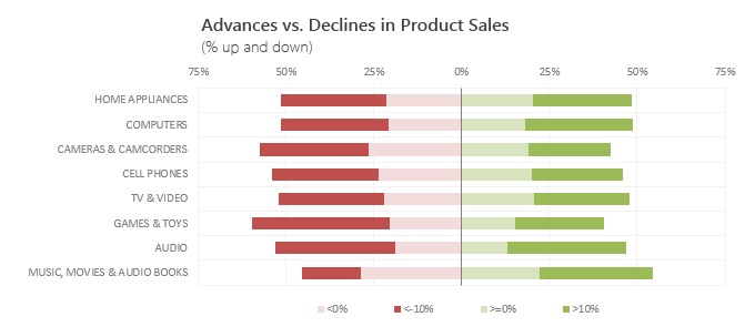
Lets say you are responsible for sales of 100s of products (which belong to handful of categories). You are looking at sales of each product in last month & this month. And you want to understand whether sales are improving or declining by category. How would you do it?
Turns out, this is not a difficult problem. In fact, this question is asked every day & answered using Advances vs. Declines chart.
You may have seen this chart in financial newspapers or websites. Shown above, Advances vs. Declines chart tells us how many items have advanced & how many have declined.
Read on to learn how to create this chart using Excel.
Continue »{ 12 Comments }
Analyzing Performance of Stocks using Excel [Example]
Published on Sep 21, 2011 in Charts and Graphs
![Analyzing Performance of Stocks using Excel [Example]](https://chandoo.org/wp/wp-content/uploads/2011/09/stock-analysis-in-excel.png)
Last week, we learned how to visualize Suicides vs. Murders data using Interactive charts in Excel. William, one of our readers, took this technique and applied it to Stocks. He emailed me because he has some formula issues with the stock data. Once I solved the problem, I asked him, “Can I share this with […]
Continue »{ 4 Comments }
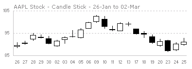
Intraday Candlestick Charting [Stock Charts]
Published on May 28, 2009 in Charts and Graphs
![Intraday Candlestick Charting [Stock Charts]](https://chandoo.org/img/n/intraday-candlestick-chart-thumb.png)
Gene asks me in an email, “I’m trying to graph candlestick charts in Excel for 10 minute candles. Excel seems to allow daily only with its stock templates. Can you point me to any resources for creating intraday candle charts?”. Of course, you can create intraday candlestick charts just the way you would create normal candlesticks, just change the axis options once you are done. Read the post to find more.
Continue »{ 20 Comments }
Japanese Candlestick Chart – Excel Tutorial
Published on Mar 4, 2009 in Charts and Graphs, Learn Excel
Japanese Candlestick Chart or Candlestick Chart as they are popularly known are one of the most commonly used stock charts.Today we will learn how to make a candlestick chart in Microsoft Excel in 4 simple steps.
Continue »{ 2 Comments }
Excel Links of the Week – Minor Changes to PHD edition
Published on Jan 26, 2009 in blogging, excel links
There are some minor changes to PHD sidebar layout and feed address. Also, in this week’s featured links learn how to Understand Stock Charts in Excel, Choose the Right Chart Using this Flow Chart, Quickly Create Named Ranges using F4 Key, Print Multiple Areas by Creating a Consolidation Sheet and Get a List of Filenames in a Directory to Excel using Browser
Continue »
