All articles with 'secondary axis' Tag
{ 11 Comments }
Excel Teens are out to get you & Other findings from our Survey
Published on Feb 25, 2011 in Charts and Graphs
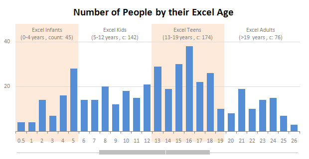
Our of curiosity and fun I asked you “how long have you been using Excel?”. I was overwhelmed by the response we got to this simple question. More than 437 people responded with their comments, stories and enthusiastic responses. Thank you so much.
It would taken me more time to make the charts and understand the data. But thanks to Hui, who volunteered to tabulate all the survey data in a simple CSV.
Shown above is a chart I came up with based on the data. Read the rest of the post to understand the survey results and view more charts. Also, you can download the excel workbooks and original data set to play.
Continue »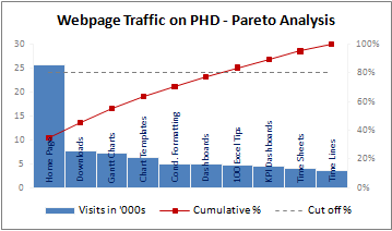
A Pareto chart or pareto graph displays the importance of various factors in decreasing order in columns along with cumulative importance in a line. Pareto charts are often used in quality control to display most common reasons for failure, customer complaints or product defects. The pareto chart is a great way to do the pareto analysis. Today, we will learn how to use excel to make a pareto chart.
Continue »{ 10 Comments }
Using Combo Charts to Group Related Time Events [Charting Goodness]
Published on Aug 26, 2009 in Charts and Graphs
![Using Combo Charts to Group Related Time Events [Charting Goodness]](https://chandoo.org/wp/wp-content/uploads/2009/08/excel-combo-chart-th.png)
In his latest book, Now You See It, on pages 165 and 166 of the book, Stephen Few discusses how grouping related time intervals can facilitate analysis of data. As an illustration he explains that when viewing data of daily website visits, it helps in separating weekdays and weekends to differentiate expected traffic during these periods. The use of this technique would make it easier for the analyst to identify any anomalous movement in ether the weekend or the week day.
Fortunately excel combo charts can help you do that. In this guest post, Paresh explains to us how to do this.
Continue »{ 8 Comments }
Create a Combination Chart, Add Secondary Axis in Excel [15 Second Tutorial]
Published on Jul 2, 2009 in Charts and Graphs, Excel Howtos
Two most commonly asked or searched queries when it comes to charting are,
- How to combine two chart types in one chart, like a line chart combined with bar chart?
- How to add a secondary axis to the chart so that one or more data series are plotted on the secondary axis?
Watch this video tutorial to learn how to do both in less than 15 seconds.
Watch it on youtube: Creating combination charts and adding secondary axis – video tutorial
Continue »
