All articles with 'quartile' Tag
{ 8 Comments }
CP010: Averages are Mean – 8 Techniques for making your analysis above average
Published on May 30, 2014 in Chandoo.org Podcast Sessions, Learn Excel
Podcast: Play in new window | Download
Subscribe: Apple Podcasts | Spotify | RSS
This is a continuation of Session 9 – Averages are mean
In the earlier episode, we talked about AVERAGE and why it should be avoided. In this session, learn about 8 power analysis techniques that will lift your work above averages.
In this podcast, you will learn,
- Re-cap – Why avoid averages
- 8 Techniques for better analysis
- #1: Start with AVERAGE
- #2: Moving Averages
- #3: Weighted Averages
- #4: Visualize the data
- …
- Conclusions
{ 8 Comments }
CP009: Averages are Mean – Know these things before you make any more AVERAGE()s
Published on May 22, 2014 in Chandoo.org Podcast Sessions
Podcast: Play in new window | Download
Subscribe: Apple Podcasts | Spotify | RSS
In the 9th session of Chandoo.org podcast, lets raise above AVERAGEs.
AVERAGEs are a very popular and universal way to summarize data. But do you know they are mean? Mean as in, AVERAGEs do not reveal much about your data or business. In episode 9 of Chandoo.org podcast, we tackle this problem and present solutions.
In this podcast, you will learn,
- What is AVERAGE?
- Pitfalls of averages
- 5 statistic concepts you must understand
- Standard Deviation
- Median
- Quartiles
- Outliers
- Distribution of data
- What next?
{ 11 Comments }
Excel Teens are out to get you & Other findings from our Survey
Published on Feb 25, 2011 in Charts and Graphs
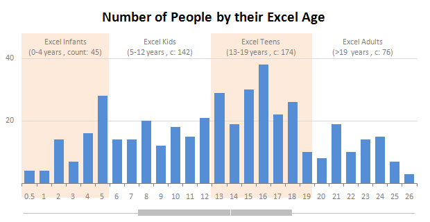
Our of curiosity and fun I asked you “how long have you been using Excel?”. I was overwhelmed by the response we got to this simple question. More than 437 people responded with their comments, stories and enthusiastic responses. Thank you so much.
It would taken me more time to make the charts and understand the data. But thanks to Hui, who volunteered to tabulate all the survey data in a simple CSV.
Shown above is a chart I came up with based on the data. Read the rest of the post to understand the survey results and view more charts. Also, you can download the excel workbooks and original data set to play.
Continue »![KPI Dashboards – Highlight KPIs Based on Percentile [Part 3 or 6]](https://chandoo.org/wp/wp-content/uploads/2008/09/kpi-dashboard-3-thumb.jpg)
Creating KPI Dashboards in Microsoft Excel is a series of 6 posts by Robert from Munich, Germany. This 6 Part Tutorial on KPI Dashboards Teaches YOU: Creating a Scrollable List View in Dashboard Add Ability to Sort on Any KPI to the Dashboard Highlight KPIs Based on Percentile Add Microcharts to KPI Dashboards Compare 2 […]
Continue »
