All articles with 'kpi dashboards' Tag
{ 1 Comment }
Top 10 Accounting KPIs and How to Calculate them in Excel?
Published on Aug 8, 2023 in Financial Modeling, Learn Excel

We can calculate any Finance & Accounting KPI values using Excel easily. In this article, I am sharing the top 10 accounting KPI calculations. These are… Topics ? Net Profit Margin Net Profit Margin = Net Profit / Sales Positive profit margin indicates business is profitable while negative indicates the business is in loss. ? […]
Continue »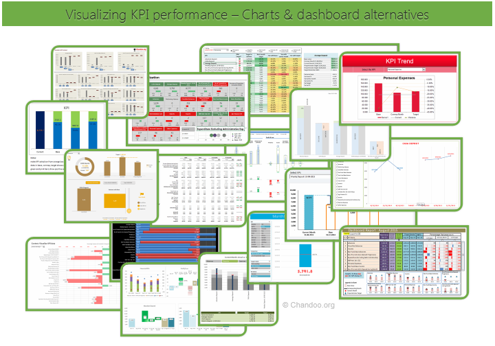
Hello all, prepare to be amazed! Here are 43 creative, fun & informative ways to visualize KPI data.
About a month ago, I asked you to visualize KPI data. We received 65 entries for this contest. After carefully reviewing the entries, our panel of judges have discarded 22 of them due to poor charting choices, errors or just plain data dumps. We are left with 43 amazing entries, each creatively analyzed the data and presented results in a powerful way.
How to read this post?
This is a fairly large post. If you are reading this in email or news-reader, it may not look properly. Click here to read it on chandoo.org.
- Each entry is shown in a box with the contestant’s name on top. Entries are shown in alphabetical order of contestant’s name.
- You can see a snapshot of the entry and more thumbnails below.
- The thumb-nails are click-able, so that you can enlarge and see the details.
- You can download the contest entry workbook, see & play with the files.
- You can read my comments at the bottom.
- At the bottom of this post, you can find a list of key charting & dashboard design techniques. Go thru them to learn how to create similar reports at work.
Thank you
Thank you very much for all the participants in this contest. I have thoroughly enjoyed exploring your work & learned a lot from them. I am sure you had fun creating these too.
So go ahead and enjoy the entries.
Continue »{ 34 Comments }
Contest: Visualize KPI data
Published on Oct 23, 2015 in Charts and Graphs, Excel Challenges
Here is a quick visualization challenge for you.
There are 25 KPIs and each has a base value, current month, corresponding month values. The KPIs also have targets.
The data looks like this:

Download the data:
Click here to download the data for this contest.
Rules for this contest:
- Visualize this data using one Excel chart (one chart per KPI is ok too).
- You may omit any any data
- You can use interactive charts.
- Do not use add-ins or VBA to make your charts
Go ahead and make your chart(s).
Continue »{ 24 Comments }
Create a line chart with bands [tutorial]
Published on May 5, 2014 in Charts and Graphs
![Create a line chart with bands [tutorial]](https://img.chandoo.org/c/line-chart-with-bands-to-depict-kpi-or-goals.png)
Here is an interesting scenario.
Imagine you are responsible for customer satisfaction at ACME Inc. Every month you track customer satisfaction rate for the 3 products you sell which are conveniently named Product A, B & C.
You also have bands for the satisfaction rating.
- Rating of 85% or below is Average
- Rating between 85% & 95% is OK
- Rating above 95% is good
At the end of the year, you want to visualize the ratings for last 12 months for 3 products along with bands.
Something like above.
Unfortunately, there is no “Insert Banded line chart” button in Excel. So what to do?
That is what we will learn today. Ready?
Continue »{ 18 Comments }
Use Advances vs. Declines chart to understand change in values
Published on Feb 21, 2013 in Charts and Graphs
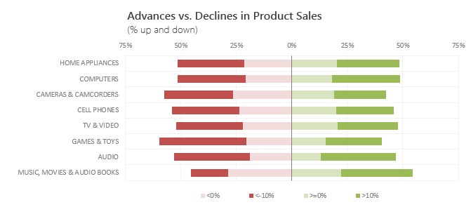
Lets say you are responsible for sales of 100s of products (which belong to handful of categories). You are looking at sales of each product in last month & this month. And you want to understand whether sales are improving or declining by category. How would you do it?
Turns out, this is not a difficult problem. In fact, this question is asked every day & answered using Advances vs. Declines chart.
You may have seen this chart in financial newspapers or websites. Shown above, Advances vs. Declines chart tells us how many items have advanced & how many have declined.
Read on to learn how to create this chart using Excel.
Continue »{ 21 Comments }
Simple KPI Dashboard using Excel
Published on Aug 25, 2011 in Charts and Graphs, Cool Infographics & Data Visualizations
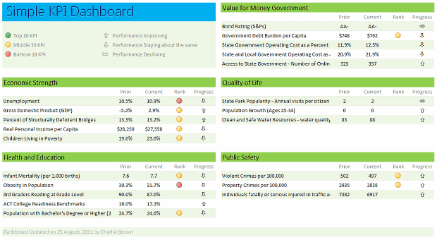
Any Tom, Dick and Sally can make things complex. It takes guts and clarity to simplify things. That is why I was pleasantly surprised to see this dashboard prepared by Michigan State. You can see it in the detailed article.
Linda, one of My Excel School students shared this dashboard link with me and asked if I can show how to construct something like this. Here is my version of the dashboard.
Read this post to learn how to construct a similar dashboard on your own. Also, you can download the excel workbook and play with it.
Continue »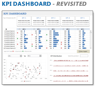
In 2008, I received an email from Robert Mundigl, which was the start of a life-long friendship. Robert asked me if he can teach us how to make KPI dashboards using Excel. I gladly said yes because I am always looking for new ways to use Excel.
The original KPI dashboards using Excel article was so popular. They still help around 12,000 people around the globe every month. Many of our regular readers and members have once started their journey on Chandoo.org from these articles.
In this article, we will revisit the dashboard and give it a fresh new spin using Excel 2007.
Continue »{ 39 Comments }
How Francis Landed on Chandoo.org, Become Awesome and Made a Superb Dashboard, all in ONE Weekend
As part of our Reader Awesomeness Week, Francis shares with us a travel site dashboard he made for his company. Francis took just two days to prepare this awesome dashboard which uses concepts like bullet charts, sortable KPI grid, Date based filtering, dynamic charts and more. I was really moved by Francis’ gesture in sharing his work with us, so much that, I did a video review of his work. You can see it in the embedded youtube video to the left.
Read the rest of the article to know how this dashboard is made and get a copy of the file.
Continue »{ 12 Comments }
Dynamic Dashboard in Excel – Pulling it all together [Part 4 of 4]
Published on May 26, 2010 in Charts and Graphs, VBA Macros
![Dynamic Dashboard in Excel – Pulling it all together [Part 4 of 4]](https://chandoo.org/img/ed/excel-dynamic-dashboard-final-th.png)
In the last installment of our dynamic dashboard tutorial, we will take all that we have learned in first 3 parts and combine that to create a final dashboard. We are going to use concepts like table of contents, macros and data validation to help us get ahead. You can find the entire macro and downloadable workbook inside the post. Read on…
Continue »{ 6 Comments }
Making a Dynamic Dashboard in Excel [Part 3 of 4]
Published on Apr 22, 2010 in Charts and Graphs, VBA Macros
![Making a Dynamic Dashboard in Excel [Part 3 of 4]](https://chandoo.org/img/ed/moving-objects-with-vba.gif)
In this post we are going to look at a simple example of the VBA behind the Dynamic Dashboard. Essentially we will learn to write macros for doing this. Read the rest of this post to find code samples and downloadable files to play with.
Continue »{ 10 Comments }
Making a Dynamic Dashboard in Excel [Part 2 of 4]
Published on Mar 30, 2010 in Charts and Graphs, Learn Excel
In part 2 of Excel Dynamic Dashboard Tutorial, we will learn how to set up various dynamic charts that are part of the dashboard. We start with a simple dynamic pie chart that shows the sales distributions and then move on to sales trend line charts. These charts use various excel formulas to pull in the information based on user selection.
Continue »
In this and next 3 posts, we will learn how to make a Dynamic Dashboard using Microsoft Excel.
At the end of this tutorial, you will learn how easy it is to set up a dynamic dashboard using excel formulas and simple VBA macros.
Continue »{ 115 Comments }
Sales Dashboards – Visualizing Sales Data – 32 Dashboard Examples & Implementations
Published on Jan 4, 2010 in Charts and Graphs, Featured

Sales reports and dashboards are very common in any company. There are several ways in which you can visualize sales data to understand the trends and sales performance. So in November, I have asked you to visualize sales data using sample data. The visualization challenge #2, sponsored by Zoho Reports generated a huge buzz around the community and fetched 32 incredible entries. The response was so overwhelming that it took me almost 24 hours to write this post. Thanks everyone for participating and making this a huge learning experience for everyone. Personally I have learned several useful dashboard and charting tricks. I will be sharing some of these lessons with all of you in the coming weeks.
Continue »{ 9 Comments }
Excel Tips Submitted by You [Part 1]
Published on May 11, 2009 in Excel Howtos, Learn Excel
The first installment of “your week @ PHD” features 4 excel tips shared by our readers: (1) A macro to unhide all sheets (2) a KPI Dashboard with VBA and Charts (3) Using Excel’s Find to Save time at work (4) An Array Formula to Solve a Tricky Problem.
Continue »
