All articles with 'free' Tag

I recently finished a long consulting gig with one of the government ministries in New Zealand. Guess what I was doing? HR Analytics and Reporting. In this post, I want to share my top 5 Excel tips for HR people, based on what I learned in the last 18 months.
Specifically, we will cover:
- Gathering and structuring Employee data in Excel
- How to use Power Query to collect data
- Polish / clean data in Power Query
- Bring cleaner data to Excel as refreshable table
- Answering questions about employees
- Using Excel formulas such as COUNTIFS, SUMIFS, AVERAGEIFS
- Pivot tables for data analysis
- Understanding the results quickly with conditional formatting
- Understanding pay gap
- Calculating gender pay gap
- Visualize pay gap
- Creating salary distribution charts
- Working with histogram charts in Excel 2016 / Office 365
- Making interactive charts
- Generating letters thru mail merge
- Calculating employee bonus based on bonus mapping logic
- Creating 100s of letters with a single click using Mail Merge + Word
Sounds interesting? Read on for details.
Continue »Would you like to spend next 5 minutes learning how to create an mutual fund tracker excel sheet?
Make a live, updatable mutual fund portfolio tracker for Indian markets to keep track of your investments using this example.
Continue »{ 13 Comments }
Take your Excel Baby Steps with 89 Minutes of FREE Online Training
Published on Aug 11, 2010 in Charts and Graphs, Learn Excel
I don’t remember when was the last time both of us (Jo and I) were this excited. And the reason?
Nakshatra and Nishanth have started taking their first steps last week !!!
It is such a joy watching them take one step at a time. Aah, the beauty of parenting 🙂
So I asked myself, “What is a good way to celebrate this without looking like a super-excited dad?” and I got my answer in 72 milli-seconds.
I have created 10 short (<10 min) videos helping you to take baby steps in Excel world. Each video introduces you to one new functionality of Excel and shows you some nice examples. Before jumping straight in to the videos, I want to share a short clip (30 seconds) of our kids taking their baby steps.
Continue »{ 164 Comments }
7 Personal Expense Trackers using Excel – Download Today
Published on Jul 16, 2010 in Charts and Graphs, excel apps
Keeping track of your expenses is one of the fundamentals of living good life. So I asked you to prepare a personal expense tracker as part of our 10,000 RSS Subscriber Milestone contest. I have received 7 excellent entries in this contest, each capable of making expense tracking a breeze while providing good analytics of […]
Continue »
While I was working Denmark, there is one thing I noticed. Danes are one hell of football lovers. The football (soccer) enthusiasm is over the top when there is a match between Denmark and Sweden. A common practice in many offices is a football pool. This is how it works: When there is a match […]
Continue »{ 5 Comments }
Attend Free Excel Training Session by Me on May 25th
Published on May 20, 2010 in Learn Excel

Fantastic news folks… As part of Office 2010 launch, Microsoft India is arranging a virtual launch event on May 25th and 26th. There are a ton of cool sessions on various Office products. I will be presenting on “Sparklines and Conditional Formatting” On May 25th between 3:30 – 5 PM IST (we are GMT + […]
Continue »{ 8 Comments }
Introducing PHD Sparkline Maker – Dead Simple way to Create Excel Sparklines
Published on Mar 22, 2010 in Charts and Graphs

Sparkline or Microchart is a tiny little chart that you can place on dashboards, reports or presentations to provide rich visualization without loosing much space. In excel 2010, MS introduced a beautiful feature for creating sparklines from data in spreadsheets. For earlier versions of Excel (that is 2007 and before) there is no native support […]
Continue »{ 88 Comments }
Track Your Mutual Fund Portfolio using Excel [India Only]
Published on Dec 28, 2009 in excel apps, personal finance
Excel is very good for keeping track of your investments. Due to its grid nature, you can easily create a table of all the mutual fund holdings and monitor the latest NAVs (Net Asset Values) to see how your investments are doing. A while back we have posted a file on tracking mutual funds using excel. Today we are going to release an upgrade for that file.
Read the rest of this post to understand how this template works and download the free template.
Continue »{ 22 Comments }
Master Excel 2007 Ribbon with this Free Learning Guide
Published on Sep 17, 2009 in Featured, Learn Excel
Over the last few years, there has been much debate about the merits and perils of Microsoft Ribbon UI in Excel 2007. Personally I think ribbon is a good way to explore an application. I have gotten used to it since I tested excel 2007 for first time. Now, during the rare occasions I work […]
Continue »{ 33 Comments }
Excel Time Sheets and Resource Management [Project Management using Excel – Part 4 of 6]
![Excel Time Sheets and Resource Management [Project Management using Excel – Part 4 of 6]](https://chandoo.org/img/pm/timesheets-excel-templates.gif)
Timesheets are like TPS reports of any project. Team members think of them as an annoying activity. For managers, timesheets are a vital component to understand how team is working and where the effort is going. By using Microsoft Excel capabilities you can create a truly remarkable timesheet tracking tool.
In this installment of project management using excel series, we will learn 3 things about timesheets and resource management using Excel
1. How to setup a simple timesheet template in excel?
2. How to make a more robust timesheet tracker tool in Excel?
3. How to use the timesheet data to make a resource loading chart?
{ 19 Comments }
Make an Impressive Product Catalog [spreadsheets for small business]
Published on Jul 13, 2009 in excel apps, Learn Excel
![Make an Impressive Product Catalog [spreadsheets for small business]](https://chandoo.org/img/l/product-catalog-small-business-spreadsheet.gif)
It is the customer on the phone again, she wants to know what products we have.
How cool would it be if we can send her a spreadsheet with all the products neatly listed in a table and she can use filters to find what she likes. Alas, we end up sending a biggish PDF brochure that is both difficult to make and maintain.
Well, not any more.
Today we will learn a very useful and fun trick in Excel. We will create a product catalog using Excel that you can send to your clients or boss (and impress them).
Continue »![Project Management: Show Milestones in a Timeline [Part 3 of 6]](https://chandoo.org/img/pm/project-timeline-chart-excel-th.png)
Learn how to create a timeline chart in excel to display the progress of your project. Timelines are a good way to communicate about the project status to new team members and stake holders. Also, download the excel timeline chart template and make your own timeline charts.
Continue »In today’s installment of project management using excel, we will learn about project tracking tool – to-do lists. Projects are nothing but a group of people getting together and achieving an objective – like building system or constructing a bridge. While it is important to have a overall project plan and vision, it is equally important to understand how various day to day project activities are going on. This is where to do lists can help you a lot. Read on…
Continue »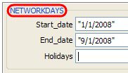
We all know that networkdays() an extremely powerful and simple excel formula can help you calculate no. of working days between 2 given dates.
But there is one problem with it. It assumes 5 day workweek starting with Monday to Friday. Not all countries have workweek from Monday to Friday.
This got me thinking and I ended up writing a user defined formula (UDF) to calculate working days between 2 given dates with any criteria. This will be good for calculating payrolls for temporary workers, offshore partners and of course people working countries where Saturday or Sunday or not usually holidays.
Continue »{ 81 Comments }
Excel Conditional Formatting Basics
Published on Mar 13, 2009 in Excel Howtos, Learn Excel
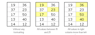
Do you know What is excel conditional formatting? Learn the basics, few examples and see how you can use it in day to day work in this installment of spreadcheats.
Continue »
