All articles with 'dynamic charts' Tag
{ 5 Comments }
Generate a snow flake pattern Excel [holiday fun]
Published on Dec 23, 2015 in Charts and Graphs
![Generate a snow flake pattern Excel [holiday fun]](https://chandoo.org/wp/wp-content/uploads/2015/12/snow-flake-pattern-in-excel.png)
Yesterday I saw a tweet from @JanWillemTulp with random snow flake generator.
That got me thinking…? Why can’t we make a snow flake pattern in Excel?
This is what I came up with.
Read on to know more about this snow flake and download the example workbook.
Continue »
Podcast: Play in new window | Download
Subscribe: Apple Podcasts | Spotify | RSS
In the 48th session of Chandoo.org podcast, let’s make some animated charts!!!
What is in this session?
In this podcast,
- Announcements
- Why animate your charts?
- Non-VBA methods to animate charts
- Excel 2013’s built-in animation effects
- Iterative formula approach
- VBA based animation
- Cartoon film analogy
- Understanding the VBA part
- Example animated chart – Sales of a new product
- Resources and downloads for you
{ 15 Comments }
Use shapes to enhance your Excel charts [tip]
Published on Aug 8, 2015 in Charts and Graphs
![Use shapes to enhance your Excel charts [tip]](https://chandoo.org/wp/wp-content/uploads/2015/08/use-shapes-to-enhance-your-charts.png)
Here is a simple way to enhance your Excel charts – use shapes & pictures in your charts.
We will learn how to create something like above.
Looks interesting? Read on…
Continue »{ 12 Comments }
How to create dynamic sparklines for latest 30 days [video]
Published on Aug 2, 2015 in Charts and Graphs, Pivot Tables & Charts
![How to create dynamic sparklines for latest 30 days [video]](https://chandoo.org/wp/wp-content/uploads/2015/08/dynamic-sparklines-v2.png)
Sparklines are fun and very insightful. They are easy to create, easy to maintain and fit into any dashboard.
But there is one tiny problem with them. Usually we have a lot of data, but we don’t to visualize all of it. We just want to visualize latest 30 days trend or last 12 months trend or QTD or something similar. What then?
In this video, learn a powerful and very simple way to create dynamic sparklines using Excel.
Continue »{ 49 Comments }
Introduction to Slicers – What are they, how to use them, tips, advanced techniques & interactive reports using Excel Slicers
Published on Jun 24, 2015 in Learn Excel, Pivot Tables & Charts
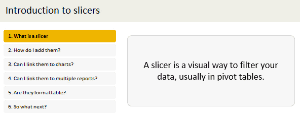
Slicers are one of my favorite feature in Excel. And here is a quick demo to show why they are my favorite.
Slicers – what are they?
Slicers are visual filters. Using a slicer, you can filter your data (or pivot table, pivot chart) by clicking on the type of data you want.
For example, let’s say you are looking at sales by customer profession in a pivot report. And you want to see how the sales are for a particular region. There are 2 options for you do drill down to an individual region level.
- Add region as report filter and filter for the region you want.
- Add a slicer on region and click on the region you want.
With a report filter (or any other filter), you will have to click several times to pick one store. With slicers, it is a matter of simple click.
Read more to learn all about slicers
Continue »{ 29 Comments }
Changing stubborn opinions with visualizations [case study]
Published on May 29, 2015 in Charts and Graphs
![Changing stubborn opinions with visualizations [case study]](https://chandoo.org/wp/wp-content/uploads/2015/05/family-income-vs-college-enrollment-nytimes.png)
We, analysts take pride in the fact that we tell stories. But what if you have a boss, client or colleague who wouldn’t buy the story?
This is a problem we face often. Let’s say your boss has stubborn opinion about something, like more advertising leads to more sales. You know the data doesn’t support this theory. But how do you change your boss’ mind?
Here is an interesting way, showcased in NY Times recently.
Continue »{ 13 Comments }
Narrating the story of change using Excel charts – case study
Published on May 18, 2015 in Charts and Graphs, Cool Infographics & Data Visualizations

Here are three questions you often hear from your boss:
- What changes are happening in our business and how do they look?
- Do you know how to operate this new coffee machine?
- Why does every list has 3 items?
Jokes aside, our urge to find change in environment predates cave drawing, slice bread and Tommy Lee Jones. So, today let’s examine a very effective chart that tells the story of change and re-create it in Excel.
Continue »{ 28 Comments }
Celebrate Holi with this colorful Excel file
Published on Mar 6, 2015 in Charts and Graphs, VBA Macros

Today is Holi, the festival of colors in India. It is a fun festival where people smear each other with colors, water balloons, tomatoes and sometimes rotten eggs. This year we wanted to play with only water guns, but kids vetoed that idea vehemently. So we ended up driving to my sister-in-law’s place to play with colors (there were no rotten eggs or tomatoes, thankfully).
Let me smear a few colors on you
I would love to splash a jug full of color water on you and say Happy Holi. But the internets have not advanced thus far. So I am going to give you the next best option.
An Excel workbook to play holi
Continue »{ 12 Comments }
A better chart to visualize “Best places to live” – Top 100 cities comparison Excel chart
Published on Oct 8, 2014 in Charts and Graphs, Cool Infographics & Data Visualizations
Recently, I saw this chart on Economist website.
It is trying to depict how various cities rank on livability index and how they compare to previous ranking (2014 vs 2009).
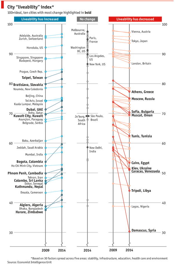
As you can see, this chart is not the best way to visualize “Best places to live”.
Few reasons why,
- The segregated views (blue, gray & red) make it hard to look for a specific city or region
- The zig-zag lines look good, but incredibly hard to understand % changes (or absolute changes)
- Labels are all over the place, thus making data interpretation hard.
- Some points have no labels (or ambiguous labels) leading to further confusion.
After examining the chart long & hard, I got thinking.
Its no fun criticizing someones work. Creating a better chart from this data, now thats awesome.
Continue »{ 43 Comments }
Mapping relationships between people using interactive network chart
Published on Aug 13, 2014 in Charts and Graphs

Today, lets learn how to create an interesting chart. This, called as network chart helps us visualize relationships between various people.
Demo of interactive network chart in Excel
First take a look at what we are trying to build.
Looks interesting? Then read on to learn how to create this.
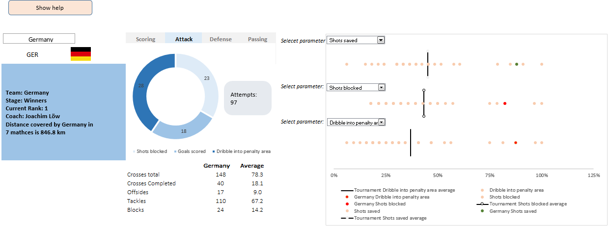
Continue »This is a guest post by Krishna, a football lover & one of our readers.
The wait for lifting the most valued priced in football for Germans was finally over. For a football fan, world cup is best time that is scheduled every four years and that if your favorite team lifting the trophy is like your crush is going on a date with you. 🙂
A sneak-peek at the final dashboard
Here is the final dashboard (it has more functionality than depicted). Click on it to enlarge.
{ 7 Comments }
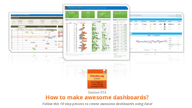
CP014: How to create awesome dashboards – 10 step process for you
Published on Jul 10, 2014 in Chandoo.org Podcast Sessions, Charts and Graphs
Podcast: Play in new window | Download
Subscribe: Apple Podcasts | Spotify | RSS
In the 14th session of Chandoo.org podcast, lets figure out how to make awesome dashboards.
What is in this session?
Excel based dashboards are much in demand these days, thanks to advancements in Excel & growing pressure on costs. Now a days, analysts & managers are expected to quickly put together a dashboard using Excel. But how do you make a dashboard? What process you should follow? These are the questions we address in this podcast.
In this podcast, you will learn,
- Announcements about upcoming dashboard classes
- Ten step process for creating awesome dashboards
- 1. Talk to your end users
- 2. Make a sketch of the dashboard
- 3. Validate your understanding
- 4. Collect data
- 5. Structure the data
- …
{ 10 Comments }
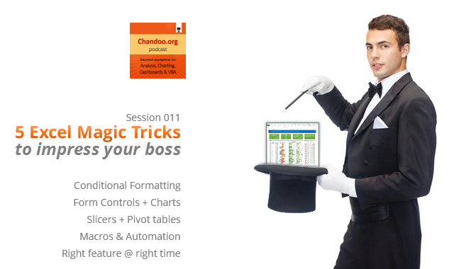
CP011: 5 Excel magic tricks to impress your boss
Published on Jun 19, 2014 in Chandoo.org Podcast Sessions
Podcast: Play in new window | Download
Subscribe: Apple Podcasts | Spotify | RSS
If you want to create magical effect with your Excel workbook (or report, dashboard, model), then hear no further. In this episode, we explore 5 very powerful magic tricks you can apply to get jaw dropping reactions from your bosses, clients & colleagues.
In this podcast, you will learn,
- Annoucements
- Why magic
- 5 Excel Magic Tricks
- 1: Conditional formatting
- 2: Form controls + Charts
- 3: Pivot tables + Slicers
- 4: Macros + Automation
- 5: Using right feature @ right time
- How to learn these magic tricks
- Conclusions
{ 8 Comments }
Closing gaps in this Gender Equality Gap chart…
Published on Nov 5, 2013 in Charts and Graphs
Today lets close some gaps.
Recently I saw this interesting chart on Economist Daily Charts page. This chart is based on World Economic Forum’s survey on how women compare to men in terms of various development parameters. First take a look at the chart prepared by Economist team.
So what are the gaps in this chart?
This chart fails to communicate because,
- All country charts look same, thus making it difficult to spot any deviations.
- We cannot quickly compare one country with another on any particular indicator.
- It does not provide a better context (for eg. how did these countries perform last year?)
But criticizing someone’s work is not awesome. Fixing it and making an even better chart, that has awesome written all over it. So that is what we are going to do. You can see the improved chart above. Click on it to learn how you can create it.
Continue »{ 7 Comments }
Last day for enrollments – Join our Power Pivot class & become awesome analyst
Published on Aug 16, 2013 in Power Pivot
 Hi folks,
I have a quick announcement & a creative dashboard to share with you. First the announcement.
Only few hours left to join our Power Pivot course…
As you may know, I have opened enrollments for our 2nd batch of Power Pivot course few days ago. The aim of this course is to make you awesome in Excel, Advanced Excel, Dashboards, Power Pivot & Advanced Power Pivot.
We will be closing the doors of this program at midnight, today (11:59 PM, Pacific time, Friday, 16th of August).
If you want to join us, click here and enroll now.
Continue »
