All articles with 'dot plots' Tag
{ 24 Comments }
Suicides & Murders by US States – An Interactive Excel Chart
Published on Sep 9, 2011 in Charts and Graphs, Cool Infographics & Data Visualizations
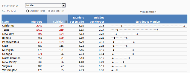
Over at PTS Blog, my dear friend & charting guru, Jon Peltier has an interesting post on using dot plots to visualize Murders & Suicides data by US States.
Not that murders & suicides fascinate me, but I wanted to play with this data myself and see how we can visualize it. So I emailed Jon and asked him to share the raw data. Being a lovely chap Jon is, he immediately sent me the data. So here we are, playing with gory data on a Friday.
Suicides & Murders by US States – An Interactive Excel Chart
You can see a demo of the chart I came up with above. Read on to learn how this chart is constructed.
Continue »{ 33 Comments }
What new chart types you want to see in Excel? [poll]
Published on Jun 18, 2010 in Charts and Graphs
![What new chart types you want to see in Excel? [poll]](https://chandoo.org/img/polls/what-new-chart-in-excel.png)
Hui, one of our in-house excel ninjas at Chandoo.org Forums, has asked an interesting question. Microsoft is already planning the next version of Excel and is looking for our feedback into what extra chart types it should offer/include. [more] It is an interesting question, so lets have a poll. What new chart types you prefer […]
Continue »{ 19 Comments }
Survey Results in Dot Plot Panel Chart [followup on Incell Panel Chart]
Published on Apr 9, 2010 in Charts and Graphs
![Survey Results in Dot Plot Panel Chart [followup on Incell Panel Chart]](https://chandoo.org/img/vp/incell-dot-plot-panel.gif)
In a follow up to last week’s how to visualize survey data in excel, we will explore how you can create an incell dot plot panel chart. Please follow the links in the article to get more commentary and insights from established persona in the visualization world (including Stephen Few, Naomi, Jon etc.)
Continue »{ 1 Comment }
Excel Links of the Week – now even more downloads edition
Published on Feb 1, 2010 in excel links

Welcome to another edition of excel links. During the last week, I have revised excel downloads page on PHD and now it contains over 75 excel templates, tutorial downloads. I am not sure if you dig the new format of the page though. So go take a look at it and let me know what […]
Continue »
Yesterday I read about interaction plots on junk charts where he points out the merits of an interaction plot. Interaction plots show interaction effects between 2 factors. For eg. you can show how your product sales have changed between year 1 and year 2 using an interaction plot like the one shown aside.
Continue »{ 21 Comments }
Incell Dot Plots in Microsoft Excel
Published on Jun 10, 2009 in Charts and Graphs, Learn Excel

Dot plots are a very popular and effective charts. According to wikipedia “Dot plots are one of the simplest plots available, and are suitable for small to moderate sized data sets. They are useful for highlighting clusters and gaps, as well as outliers.”
Today we will learn about creating in-cell dot plots using excel. We will see how we can create a dot plot using 3 data series of some fictitious data.
Continue »
