All articles with 'data model' Tag
{ 8 Comments }
Advanced Pivot Table Tricks for you
Published on Feb 27, 2020 in Cool Infographics & Data Visualizations, Pivot Tables & Charts, Power Pivot, Power Query

Excel Pivot tables make data analysis and visualization easy. With the help of these advanced pivot table skills, you can create powerful data analytics and reports. New to Pivot Tables? If you are new to Pivot Tables, check out this excellent introduction to Pivot Tables page. × Dismiss alert Table of Contents #1 – One Slicer, Two […]
Continue »
As part of our Excel Interview Questions series, today let’s look at another interesting challenge. How can you analyze more than 1 million rows data in Excel?
You may know that Excel has a physical limit of 1 million rows (well, its 1,048,576 rows). But that doesn’t mean you can’t analyze more than a million rows in Excel.
The trick is to use Data Model.
Continue »{ 24 Comments }
How to generate all combinations from two separate lists [Pivot Table Trick]
Published on Oct 4, 2016 in Pivot Tables & Charts
![How to generate all combinations from two separate lists [Pivot Table Trick]](https://chandoo.org/wp/wp-content/uploads/2016/10/join-combinations-of-two-tables-excel.png)
Time for a quick but very useful tip. Ever wanted to create all combinations from two (or more) lists? a la Cartesian product of both lists.
Here is a ridiculously simple way to do it.
Continue »{ 49 Comments }
Introduction to Slicers – What are they, how to use them, tips, advanced techniques & interactive reports using Excel Slicers
Published on Jun 24, 2015 in Learn Excel, Pivot Tables & Charts
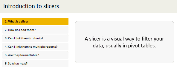
Slicers are one of my favorite feature in Excel. And here is a quick demo to show why they are my favorite.
Slicers – what are they?
Slicers are visual filters. Using a slicer, you can filter your data (or pivot table, pivot chart) by clicking on the type of data you want.
For example, let’s say you are looking at sales by customer profession in a pivot report. And you want to see how the sales are for a particular region. There are 2 options for you do drill down to an individual region level.
- Add region as report filter and filter for the region you want.
- Add a slicer on region and click on the region you want.
With a report filter (or any other filter), you will have to click several times to pick one store. With slicers, it is a matter of simple click.
Read more to learn all about slicers
Continue »{ 41 Comments }
How to use Excel Data Model & Relationships
Published on Jul 1, 2013 in Excel Howtos, Pivot Tables & Charts

Have you ever been in a VLOOKUP hell?
Its what happens when you have to write a lot of vlookup formulas before you can start analyzing your data. Every day, millions of analysts and managers enter VLOOKUP hell and suffer. They connect table 1 with table 2 so that all the data needed for making that pivot report is on one place. If you are one of those, then you are going to love Excel 2013’s data model & relationships feature.
Continue »{ 48 Comments }
10 things that wowed me in Excel 2013
Published on Apr 3, 2013 in Charts and Graphs, Learn Excel
As you may new, the newest version of Excel is out for a while. I have been using it since last 6 months and enjoying it. Today, lets understand 10 things in 2013 that wowed me (and probably you too).
Continue »
