All articles with 'data labels' Tag
{ 24 Comments }
Create a line chart with bands [tutorial]
Published on May 5, 2014 in Charts and Graphs
![Create a line chart with bands [tutorial]](https://img.chandoo.org/c/line-chart-with-bands-to-depict-kpi-or-goals.png)
Here is an interesting scenario.
Imagine you are responsible for customer satisfaction at ACME Inc. Every month you track customer satisfaction rate for the 3 products you sell which are conveniently named Product A, B & C.
You also have bands for the satisfaction rating.
- Rating of 85% or below is Average
- Rating between 85% & 95% is OK
- Rating above 95% is good
At the end of the year, you want to visualize the ratings for last 12 months for 3 products along with bands.
Something like above.
Unfortunately, there is no “Insert Banded line chart” button in Excel. So what to do?
That is what we will learn today. Ready?
Continue »{ 65 Comments }
Change Data Labels in Charts to Whatever you want [Quick Tip]
Published on May 5, 2010 in Charts and Graphs
![Change Data Labels in Charts to Whatever you want [Quick Tip]](https://chandoo.org/img/q/custom-data-labels-example-chart.png)
We all know that Chart Data Labels help us highlight important data points. When you “add data labels” to a chart series, excel can show either “category” , “series” or “data point values” as data labels.
But what if you want to have a data label that is altogether different, like this:
Of course you can point data labels to any cell. In this quick tip, we will learn how to do this, read on…
Continue »{ 22 Comments }
A Brief History of Microsoft Excel – Timeline Visualization
Published on Jan 13, 2010 in Charts and Graphs, Cool Infographics & Data Visualizations
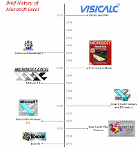
Timeline charts are great for providing quick snapshots of historical events. And hardly a day goes by without some one making a cool visualization of a time line of this or that. Time lines are easy to read, present information in a logical manner and mostly fun.
So yesterday, I set out to mimic the iconic gadgets of all time in excel, just for fun. Then it strike me, why not make a visual time line of Microsoft Excel ? So I did that instead.
Continue »{ 39 Comments }
Make a Quick Thermometer Chart to Compare Targets and Actuals
Published on Dec 17, 2009 in Charts and Graphs

Comparing values is one of the reasons why we make charts. So today I am going to teach you a handy little trick to make a thermometer like chart to compare targets with actuals. This type of chart is very useful when you have a bunch of sales targets and you want to measure how the performance has been.
Continue »{ 7 Comments }
Dashboard Best Practice – Google Analytics Intelligence Report
Published on Nov 4, 2009 in Charts and Graphs, Cool Infographics & Data Visualizations
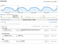
Yesterday while checking my website analytics reports on Google analytics site, I have noticed a new beta feature called “Intelligence”. Out of curiosity I clicked on it. It took me to a an intelligence alert dashboard. Ok, lets just back up for a minute and understand what “intelligence dashboard” is before moving on. In the […]
Continue »
Yesterday I read about interaction plots on junk charts where he points out the merits of an interaction plot. Interaction plots show interaction effects between 2 factors. For eg. you can show how your product sales have changed between year 1 and year 2 using an interaction plot like the one shown aside.
Continue »{ 15 Comments }
Make a Bubble Chart in Excel [15 second tutorial]
Published on Oct 5, 2009 in Charts and Graphs, Excel Howtos
![Make a Bubble Chart in Excel [15 second tutorial]](https://chandoo.org/img/l/bubble-chart-excel-tutorial.png)
A Bubble chart displays circles (or bubbles) at given X and Y co-ordinates. Bubble chart is a very good way to show 3 dimensional data (for eg. Region-wise product sales) without confusing users. In this tutorial, we will learn how to create a bubble chart using excel.
Continue »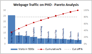
A Pareto chart or pareto graph displays the importance of various factors in decreasing order in columns along with cumulative importance in a line. Pareto charts are often used in quality control to display most common reasons for failure, customer complaints or product defects. The pareto chart is a great way to do the pareto analysis. Today, we will learn how to use excel to make a pareto chart.
Continue »{ 7 Comments }
Charting Lessons from Optical Illusions
Published on Jul 28, 2009 in Charts and Graphs, Featured

The other day while doing aimless roaming on the dotcom alley, I have seen some cool optical illusions. There are so many valuable lessons optical illusions can teach us – chart makers. Don’t believe me? Look at the bubble chart illusion on the left and tell me which orange circle is bigger? What is your answer? Right or left. Well, my friend, the answer is both are of same size. Read the rest of this post to find some cool optical illusions and what they can teach us – chart makers.
Continue »![Project Management: Show Milestones in a Timeline [Part 3 of 6]](https://chandoo.org/img/pm/project-timeline-chart-excel-th.png)
Learn how to create a timeline chart in excel to display the progress of your project. Timelines are a good way to communicate about the project status to new team members and stake holders. Also, download the excel timeline chart template and make your own timeline charts.
Continue »{ 2 Comments }
Interview With Presentation Zen’s Garr Reynolds on Charting & Telling Stories
Published on Jun 15, 2009 in Charts and Graphs
As mentioned earlier, I have met Garr Reynolds of presentation zen fame in Malmo, Sweden last Friday. What was to be a quick 15 minute interview became a 2 hour lengthy discussion on presentations, charting, excel, data, Japanese culture and of course our pointy haired dilbert blog. Read the entire interview in the post.
Continue »{ 16 Comments }
What is Your Opinion on Pie Charts?
Published on Feb 20, 2009 in Charts and Graphs, Featured
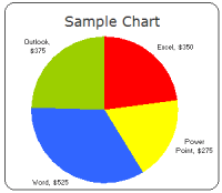
Pie charts are one of the most used charts in the world. And for obvious reasons: they are simple to create and easy to understand. When it comes to pie chart, I have no clear opinion. Part of me says use them, the other says avoid them.
What is your opinion on Pie charts ?
Continue »{ 32 Comments }
Colors in Chart Labels [Quick Tip]
Published on Jan 29, 2009 in Charts and Graphs, Learn Excel
![Colors in Chart Labels [Quick Tip]](https://chandoo.org/img/a/chart-label-formatting-trick.png)
A simple label formatting hack can improve the effectiveness of YoY change charts by adding color to differentiate positive vs. negative growth (or mediocre vs. sky rocketing growth rates). See this example:
Continue »
