All articles with 'data bars' Tag
{ 46 Comments }
6 Best charts to show % progress against goal
Published on May 8, 2020 in Charts and Graphs, Learn Excel

Back when I was working as a project lead, everyday my project manager would ask me the same question.
“Chandoo, whats the progress?”
He was so punctual about it, even on days when our coffee machine wasn’t working.
As you can see, tracking progress is an obsession we all have. At this very moment, if you pay close attention, you can hear mouse clicks of thousands of analysts and managers all over the world making project progress charts.
So today, lets talk about best charts to show % progress against a goal.
Continue »{ 2 Comments }
Visualizing Commonwealth games performance – Interactive chart
Published on Apr 13, 2018 in Charts and Graphs, Power Query

The 2018 edition of Commonwealth games are on for a week now. Both of my homes – India and New Zealand have been doing so well. Naturally, I wanted to gather games data and make something fun and creative from it. Here is my attempt to amuse you on this Friday.
Looks interesting? Want to know how to make something like this on your own? Then read on…
Continue »{ 15 Comments }
“How Trump happened” in Excel [visualizations]
Published on Mar 2, 2016 in Cool Infographics & Data Visualizations, VBA Macros
![“How Trump happened” in Excel [visualizations]](https://chandoo.org/wp/wp-content/uploads/2016/03/how-trump-happened-excel-replica.png)
During last week, an alert reader of our blog, Jørgen emailed me a link to “How Trump happened“. It is an interactive visualization by Wall Street Journal. Jørgen asked me if we could replicate the visualization in Excel. My response: “Making a new chart in Excel? Hell yeah!”
Read on for awesome visualizations and full explanation.
Continue »{ 13 Comments }
Analyzing half a million complaints – Customer Satisfaction Scorecard [Part 3 of 3]
Published on Feb 23, 2016 in Charts and Graphs, Cool Infographics & Data Visualizations, Learn Excel
![Analyzing half a million complaints – Customer Satisfaction Scorecard [Part 3 of 3]](https://chandoo.org/wp/wp-content/uploads/2016/02/customer-satisfaction-scorecard-analysis-complaints-data.png)
This is the final part of our series on how to analyze half a million customer complaints. Click below links to read part 1 & 2.
- Complaint reason analysis – Part 1
- Regional trends & analysis – Part 2
Customer satisfaction scorecard
In the previous parts of this case study, we understood what kind of complaints were made and where they came from (states). For the customer satisfaction scorecard, let’s focus on individual companies.
Continue »{ 4 Comments }
How countries spend their money – chart alternatives
Published on Sep 22, 2015 in Charts and Graphs
Econimist’s daily chart is a one of my daily data porn stops. They take interesting data sets and visualize in compelling ways. While the daily chart page is insightful, sometimes they make poor charting choices. For example, this recent chart visualizing how countries spend their money uses a variation of notorious bubble chart. Click on the chart to enlarge.

What is wrong with this chart?
Bubble charts force us to measure and compare areas of circles. Unless you have a measuring tape somehow embedded in your eyes and you are a walking human scientific calculator, you would find this task impossible.
So when you look at the chart and want to find out what percentage Japanese spend on restaurants or how much Americans pay for housing, your guesses will have large error margins.
Not only bubble charts are difficult to read, they are very hard to align. So when you have a bunch of bubbles, no matter how hard you try, your chart looks clumsy (see how the Russian food bubble eats in to Mexico’s bubble, as if it is too hungry 😉 )
Let’s check out a few alternatives to this chart. Read on…
Continue »{ 0 Comments }
Make a quick funnel chart in Excel to track sales performance [video]
Published on Aug 29, 2015 in Charts and Graphs, Learn Excel
![Make a quick funnel chart in Excel to track sales performance [video]](https://chandoo.org/wp/wp-content/uploads/2015/08/funnel-chart-excel.png)
Funnel charts are useful to visualize sales & marketing performance. In this brief video, let’s understand how to make a quick funnel chart in Excel.
Read on to learn how to make funnel charts & to download a template for your funnel analysis needs.
Continue »Hello everyone. Stop reading further and go fetch your helmet. Because what lies ahead is mind-blowingly awesome.
About a month and half ago, we held our annual dashboard contest. This time the theme is to visualize state to state migration in USA. You can find the contest data-set & details here.
We received 49 outstanding entries for this. Most of the entries are truly inspiring. They are loaded with powerful analysis, stunning visualizations, amazing display of Excel skill and design finesse. It took me almost 2 weeks to process the results and present them here.
![]()
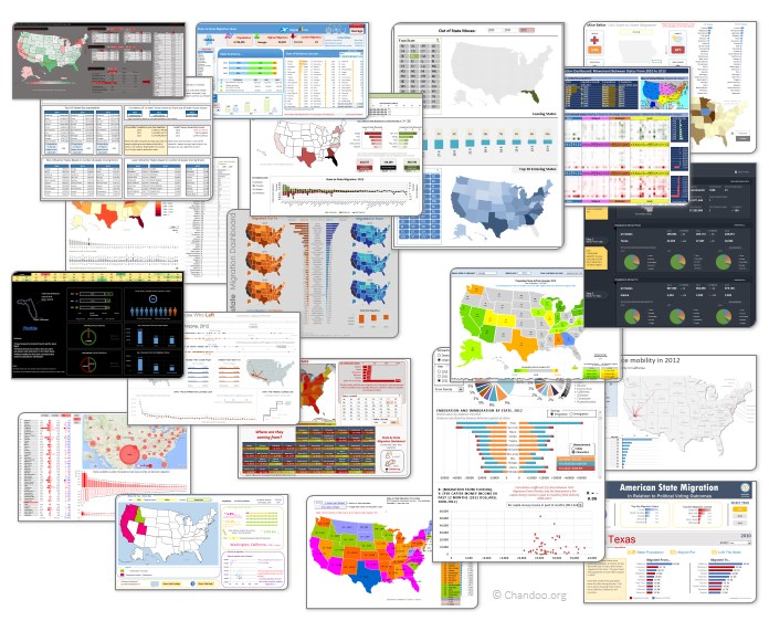
Click on the image to see the entries.
Continue »{ 5 Comments }
Health-care Dashboard in Excel [Dashboard Week]
Published on Mar 22, 2011 in Charts and Graphs
![Health-care Dashboard in Excel [Dashboard Week]](https://img.chandoo.org/dashboards/dw/health-care-dashboard-small.png)
As part of Dashboard Week, in this post, we will take a look at Health-care Dashboard prepared and shared by Alberto. He put together an excellent dashboard to visualize hospital performance and understand what is going on. Read this post to understand how this dashboard is made, watch a tutorial video & download example workbook.
Thank you Alberto for sharing the file & helping us learn.
Continue »{ 49 Comments }
New Features in Excel 2010 Conditional Formatting
Published on May 19, 2010 in Charts and Graphs, Learn Excel
Conditional formatting is one of favorite features in Excel. CF has helped me save the day at work more than a dozen occasions. I almost became project manager just because I knew how to make a gantt chart in excel using conditional formatting. I have written extensively about it.
So, I was naturally curious to explore what is new in Excel 2010’s Conditional Formatting. In this post, I will share some of the coolest improvements in CF.
Continue »
