All articles with 'axis labels' Tag
{ 16 Comments }
Excel Links – Delay in State migration visualization results edition
Published on May 20, 2014 in excel links
Hello friends,
First a quick update about state migration visualization contest.
We got more than 50 wonderful entries for this contest. I have compiled 50% of the entries. Due to personal reasons (its annual vacation time at our household), I had to delay the rest and resume it after first week of June. So the results will be announced in 2nd week of June. Thanks for understanding and your patience. Watch this space for mind-boggling dashboards in 3 more weeks.
Click “Read more” to get a sneak-peek at 3 random entries & 4 useful Excel links.
Continue »{ 6 Comments }
Chart for wall hygrometric physic (or how to create a chart with custom x axis intervals?)
Published on Apr 18, 2013 in Charts and Graphs
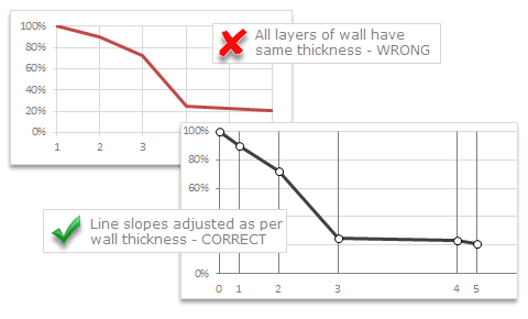
Livio, one of our readers from Italy sent me this interesting problem in email.
Continue »I would like to prepare an xy linear graphic as representation of the variation of temperature trough a wall between two different bulk temperature i.e. outside and inside a house. This graphic should show the temperature gradient trough the wall thickness. The wall is normally made by different construction materials (different layers, as bricks, insulation, …..) and so the temperature change but not as a straight line with only one slope, instead as few lines with different slopes (see below figure) Calculations are not difficult, and also prepare the graphic also not difficult.
But, I am looking a beautiful solution for x-axis. X-axis should be divided not with constant interval, instead with different length between each sub-division exactly as the different thickness of the wall. This is a correct graphic, because you can show the correct slope of each straight line though each layer of the wall.
{ 11 Comments }
Thanks half a million… (and 2 excel tips)
Published on Oct 1, 2010 in blogging, Excel Howtos

I have a happy news to share with you!!! For the first time since starting this website, we got 500,000 + page views in the month of September 2010. Half-a-million! Thank you so much. To put this in context, in Sept 2009, we got 245,000 views. Traffic grew by more than 100% in last 12 […]
Continue »{ 32 Comments }
Introduction to Panel Charts using Excel – Tutorial & Template
Published on May 12, 2010 in Charts and Graphs, Featured
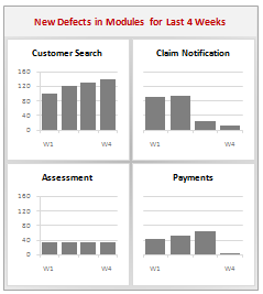
In this article we will learn what a Panel Chart is and how you can construct a panel chart in Excel.
What is a Panel Chart?
A panel chart is a set of similar charts neatly aligned in panels to help us understand some data which has multiple variables in it. Panel charts are also called by names “trellis displays” or “small multiples”. They are an effective way to display multi-variable data.
Here is an example panel chart showing the total defects per module over the last 4 weeks.
Continue »{ 15 Comments }
Make a Bubble Chart in Excel [15 second tutorial]
Published on Oct 5, 2009 in Charts and Graphs, Excel Howtos
![Make a Bubble Chart in Excel [15 second tutorial]](https://chandoo.org/img/l/bubble-chart-excel-tutorial.png)
A Bubble chart displays circles (or bubbles) at given X and Y co-ordinates. Bubble chart is a very good way to show 3 dimensional data (for eg. Region-wise product sales) without confusing users. In this tutorial, we will learn how to create a bubble chart using excel.
Continue »{ 25 Comments }
Recipe for a Donut Bar Chart
Published on Sep 30, 2009 in Charts and Graphs, Learn Excel
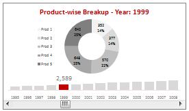
We all know that bar charts can be used to display values spread across various categories or times and pie charts / donut charts can be used to display percentage breakup of various quantities in a sum total. How about mashing up both to create a Donut Bar chart?
In this tutorial, you can learn how to make a donut bar chart and linking it to a form control to display Product-wise sales breakups spread across several years.
Continue »![Project Management: Show Milestones in a Timeline [Part 3 of 6]](https://chandoo.org/img/pm/project-timeline-chart-excel-th.png)
Learn how to create a timeline chart in excel to display the progress of your project. Timelines are a good way to communicate about the project status to new team members and stake holders. Also, download the excel timeline chart template and make your own timeline charts.
Continue »{ 4 Comments }
Intraday Candlestick Charting [Stock Charts]
Published on May 28, 2009 in Charts and Graphs
![Intraday Candlestick Charting [Stock Charts]](https://chandoo.org/img/n/intraday-candlestick-chart-thumb.png)
Gene asks me in an email, “I’m trying to graph candlestick charts in Excel for 10 minute candles. Excel seems to allow daily only with its stock templates. Can you point me to any resources for creating intraday candle charts?”. Of course, you can create intraday candlestick charts just the way you would create normal candlesticks, just change the axis options once you are done. Read the post to find more.
Continue »Here is a quick excel tip to make your charts look professional by showing symbols in the axis labels instead of text. Just follow these 4 simple steps: First identify the symbols you want to show on the axis or as data label from symbol fonts like webdings, wingdings or a custom dingbat font like […]
Continue »
