All articles with '2008 US Elections' Tag
{ 3 Comments }
Featured Visualizations – Jan 02
Published on Jan 2, 2009 in Cool Infographics & Data Visualizations
Every week Pointy Haired Dilbert celebrates visualization and info-graphics by showcasing some of the creative and fun charting work from around the web. Have inspiration and fun. Browse hundreds of fun visualization and graphics projects in archives.
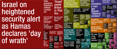
Newsmap is a creative and fun way to look at news. They organize news items on a tree map based on recency and relevancy of the news items (that are probably pulled from Google news). The background color indicates the news topic (red for world, purple for business, green for tech etc.)
Continue »{ 1 Comment }
5 Visualizations for your Inspiration [Nov 07]
Published on Nov 8, 2008 in Cool Infographics & Data Visualizations
![5 Visualizations for your Inspiration [Nov 07]](https://chandoo.org/wp/wp-content/uploads/2008/11/donations-to-obama-president-thumb.jpg)
Every week Pointy Haired Dilbert features 5 beautiful & creative info-graphic visualizations for your inspiration. I like building, reading and sharing charts and info-graphics and it is a pleasure sharing these with you all. Happy weekend 🙂 Who donated to Obama and how much? This beautiful arc chart shows how much people have donated to […]
Continue »{ 21 Comments }
Red vs. Blue – 35 Cool Visualizations on 2008 US Presidential Election
Published on Oct 7, 2008 in america, Charts and Graphs, Cool Infographics & Data Visualizations, Featured
With 2008 US Presidential elections around the corner everyone is busy including chart makers. There are hundreds of excellent visualizations on the presidential election campaign, speeches, issues, predictions that keeping track of what is best can be a tough task. We at PHD have compiled a list of 35 totally awesome visualizations on the 2008 […]
Continue »
