
 Most of us think of mastering formulas, learning macros and being supergood with charts when we think of being productive with spreadsheets. But often learning simple stuff like keyboard shortcuts, using mouse and working with menus and ribbons can be a huge productivity booster for us. So as part of this installment of spreadcheats we will learn 7 very cool and effective double click tricks in excel. (as an aside, try saying double click tricks several times faster… 😉 )
Double Click on the Office Button / Logo to Close Excel
![]()
This is simple. Displays “do you want to save…” dialog if the workbook is not saved.
Adjust column widths by selecting multiple columns and double clicking on the separators
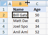
This is my favorite. You can use the same trick to adjust row heights too.
Double-click in the corner, just above scroll-bar to include a split
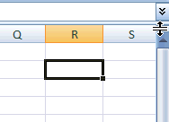
It is surprising that very few people know about split and freeze panes feature in excel. I have often seen colleagues struggling to freeze top row of a large workbook or include a split so that they can see 2 different things at a time.
You can also create a vertical split by clicking on the little bar shape next to horizontal scroll-bar near bottom right corner of the excel window.
(If you are wondering where the split would be created, it will be created at selected cell’s row (or column))
Double click on ribbon menu names to collapse ribbon to get more space

In MS Office 2007 you can double click on the ribbon menus to collapse the ribbon to one line. In Excel 2003, when you double click on the empty space in the toolbar area, it opens up the “customize” window (same as Menu > tools > customize)
Auto-fill a series of cells with data or formulas by just double clicking
I have saved countless minutes ever since I learned this little trick. Lets say you have a table where in one column you have some data and in the next you have written a formula in the first row. Now how would you copy the formula and paste it in all cells in that column?
Copy the formula (ctrl+c), select all cells, paste the formula.
Well, no more. Just select the formula in first cell, double click in the bottom right corner and see the magic.
The trick works for formulas, auto-fills (of numbers, dates, what not) as long as the adjacent column has data.
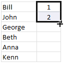
Jump to last row / column in table with double-click

Just select any cell in the table and double click on the cell-border in the direction you want to go. See the screencast.
Lock a particular feature and reuse them with double-click

You can lock any repeatable feature (like format painter, drawing connectors, shapes etc.) by just double clicking on the icon (in Excel 2007 this works for format painter, but for drawing shapes you need to right click and select lock drawing mode). This can save you a ton of time when you need to repeat same action several times.
Now its time to test your clicking skills
Try clicking on these: excel keyboard shortcuts, excel mouse tips & tricks, excel productivity tips part 1 & part 2
ok, I am kidding, but you get the point.
What is your favorite double-click-trick?
tell me please…


25 Responses to “Display Alerts in Dashboards to Grab User Attention [Quick Tip]”
I prefer the red,grey,light grey,black icon set. I've also used in-cell pie charts from Fabrice's Sparklines for Excel as an alert which could also provide another piece of information.
I prefer the red,grey,light grey,black icon set. I've also used in-cell pie charts from Fabrice's Sparklines for Excel as an alert which can also provide another piece of information.
For Excel 2007, your formula should do the same as the Excel 2003 version, so that non-alert rows are blank - if they are 0, the unnecessary green icon will show
Hi Chandoo,
Nice Post !! just to add something for EXL 2003, we can also 4 Ifs and link to the alert data
For Ex: If we have alert data in Cell A2 and want to split in 4 orders namely <25%, 25-50%, 50-75% and 75%< then we can following formula and put fonts as you have suggested :
=IF(A2<0.25,CHAR(153),IF(A2<=0.5,CHAR(155),IF(A2=0.76,CHAR(152)))))
And then using Conditional Formating we can dashboard reflected on different COLOURS as per their respective alert.
Best Regards
Rohit1409
Hi Chandoo,
Nice Post !!! just to add something for EXL 2003, we can also 4 Ifs and link to the alert data
For Ex: If we have alert data in Cell A2 and want to split in 4 orders namely <25%, 25-50%, 50-75% and 75%< then we can following formula and put fonts as you have suggested :
=IF(A2<0.25,CHAR(153),IF(A2<=0.5,CHAR(155),IF(A2=0.76,CHAR(152)))))
And then using Conditional Formating we can dashboard reflected on different COLOURS as per their respective alert.
Best Regards
Rohit1409
The Complete formula [Don't Know how it got cut ]
=IF(A2<0.25,CHAR(153),IF(A2<=0.5,CHAR(155),IF(A2=0.76,CHAR(152)))))
PS : Use in single line [I have split it to avoid cuts 😉 ]
Hi Chandoo..
why it is not displaying the complete formula..
anyways here is the balance
"=IF(A2<0.25,CHAR(153), IF(A2<=0.5,CHAR(155), IF(A2=0.76,CHAR(152)))))"
@Rohit... your formulas are fine. Just that the width of comment area is fixed and hence my website is cropping it at 640pixels. I just edited your formula and added few white spaces so that it wraps nicely.
Very good idea btw.. kudos!
Hi,
Maybe just go for 'bold' ; 'underline' or 'italic' to draw the users attention? Those methods (if those can be called methods) are used cross media type (books, journals, blogs, billboards, ...) to guide the readers eye to valuable information.
Just a basic thought
@Tom.. good idea..
[...] has a very nice writeup on how to add such alerts to dashboard sheets. Possibly related posts: (automatically generated)Divide your data set into workbooksHow to enforce [...]
Hi Chandoo,
You certainly grabbed my attention! although I wasn't sure what my brother (Suresh) and cousin (Shyam) were doing right, and I was doing wrong? 😉
I love your blog btw - Many thanks for all your hard work in unravelling the secrets and mysteries of Excel!
Best regards
Ramesh
I thought I saw an advertisment for a book about learning excel called excel himalaya or something. It cost about 35.00 us money but seemed to have the things I need to have my admin assistant to start to use. I was hoping to start with this book and then send her to school if she shows some interest and aptitude. Any help on this would be appreciated. Thanks
Great web site and information!!!!
@Jeff... checkout http://chandoo.org/wp/2010/08/25/excel-everest-review/
thanks, your website is awesome!
[...] Alerts to highlight focus areas [...]
[...] There are lots of numbers in this dashboard. I would suggest adding few more visualizations like showing indicators or applying conditional formatting or replacing a table with a chart. This would reduce the [...]
[...] is the same technique as alert icons in dashboard. Just that I also showed green [...]
[...] is the same technique as alert icons in dashboard. Just that I also showed green [...]
Hi Chandoo
Firstly thanks for all the cool tips on how to use Excel better.
I am new to the site and have a question which you may be able to assist with but dont know if these comment boxes are the best way of asking ?
I am looking at assets and trying to calculate the depreciation total by taking a year (say 2010) adding the expected life of the asset (say 10 years) then comparing that to a future date (say 2015) using an IF statement. The calculation in normal is - IF((year in col B (2010) plus 10years)>year 2015, add a years depreciation, otherwise leave blank). The converted date value does not appear able to add 10 years in order to compare it to 2015. Am I missing something ?
I use the “IF” Statement in conjunction with Conditional Formatting in MS Excel to give verbiage to alert one of a required action, dependant on a review date. This makes a visual stimulus, plus it clues one as to what the conditional format is trying to warn you about and what follow-up actions are required.
Wow, I'm really impressed with dashboards. I had no idea this stuff was even possible with excel. I'd like to offer an interactive dashboard to my customers, showing analytics of their data. I have a .pdf file with the datapoints. I'd like them to enter the data on my website, and be able to see their data. Is something like that possible.
Hi Chandoo,
I've recently purchased the package for both templates.
In the portfolio dashboard,under the calculations worksheet, I'm attempting to change the date range in the gantt chart to show only the range of the project that starts in late 2013. How do I do this?
Thanks
Adam
[...] is the same technique as alert icons in dashboard. Just that I also showed green [...]
Hi Chandoo,
I'm new at Excel Dashboard and found your blog really useful and helpful! It's very nice of you that you dedicate your time to do this.
Could you please explain how can I use Alerts based on dates on a Dashboar?
For example, if a target date is coming closer to the actual date, the alert is yellow or red.
I'd really appreciate some help!
Thank you
Where can I download the file Excel of Averall Statistics ???
Thanks a lot.