Archive for October, 2014
{ 34 Comments }
What would you wear to an Excel themed Halloween party?
Published on Oct 31, 2014 in Humor
 Its Halloween time. So humor me and imagine that Bill Gates invited you to his castle for an Excel themed party.
What costume would you wear?
Go ahead and tell me in the comments.
I will go first:
I would dress up as a spider (radar) chart. All I need is some cob webs on my regular dress.
Your turn…
Continue »{ 28 Comments }
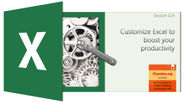
CP024: Customize Excel to boost your productivity
Published on Oct 30, 2014 in Chandoo.org Podcast Sessions, Learn Excel
Podcast: Play in new window | Download
Subscribe: Apple Podcasts | Spotify | RSS
In the 24th session of Chandoo.org podcast, let’s customize Excel so we become productive.
What is in this session?
Each of us use Excel in our own way. And yet, we all end up using the same Excel. That’s not fair. Shouldn’t the Excel of an accountant be different from Excel of a teacher?
In this podcast, lets understand some of the powerful & useful ways to customize Excel so that we can do our work better. Tune in only if you are serious about productivity.
You can get Excel Customization Handbook free. Listen to the podcast for instructions.
In this podcast, you will learn,
- Announcements
- Why customize Excel?
- Customization options:
- Excel Options
- Quick Access Toolbar
- Excel Ribbon
- File menu / back stage view
- Themes, styles & templates
- Personal Macros
- Closing thoughts & Bonus give away instructions
{ 173 Comments }
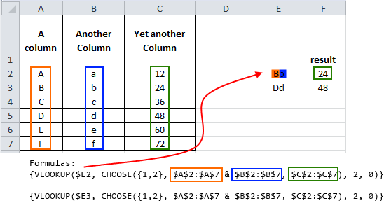
The ultimate VLOOKUP trick – Multi-condition Lookup
Published on Oct 28, 2014 in Learn Excel
This is a guest post by Sohail Anwar.
Let’s not bore you with an intro. You are about to learn a VLOOKUP trick that Lucifer himself would not want you to know. It’s so absurdly powerful that it was developed in a lab and had to be tested on Rocky’s arch nemesis Ivan Drago.
Presenting the Multiple criteria VLOOKUP!
…boring…pass, we’ve seen it.
Oh, have you? Not like this you haven’t. This will change the way you work with Excel.
Let me start with an easy example. Here’s some data and we would love to know what Bb and Dd is.
Continue »
Hello awesome folks. It has been a while since I posted on Chandoo.org. And there is a reason for that. As you may know, recently (on October 12th) a category 3 cyclone (hurricane) passed thru our city devastating trees, power lines, cellular towers, old houses & roads on its way. This means our family was left without power, water, telephone and internet for almost 10 days. Early last week we got power & water. Then slowly the internet started working too. (more on this here)
I am swimming thru heaps of email & backlog work. Thanks to everyone who emailed me with kind thoughts, prayers and love. I can’t tell you how thankful I am for having you in my life.
I am really glad to be back online, sharing my stories, knowledge & tips with you all.
As it has been a while, I want to share a few quick announcements first.
Continue »Howdy folks. Jeff here, bringing you a Public Service Announcement: Thanks to the magic of VBA , Structured PivotTable References are coming to a PivotTable near you! Structured References for PivotTables? So what? Well, because PivotTables are the best bit of ‘old’ Excel, and Tables are the best thing about ‘new’ Excel, and it’s about […]
Continue »{ 18 Comments }
CP023: My experience with Hudhud Cyclone [personal story]
Published on Oct 16, 2014 in Chandoo.org Podcast Sessions, personal
Podcast: Play in new window | Download
Subscribe: Apple Podcasts | Spotify | RSS
In the 23rd session of Chandoo.org podcast, lets talk about my experience with Hudhud cyclone.
Note: This podcast session has no Excel tips. It is a story of how our family is surviving the effects & aftermath of destructing Hudhud cyclone that recently (on 12th October) passed thru our city. Hopefully, you still find it interesting & inspiring. If you are expecting some Excel tips, check again next week.
What is in this session?
Growing up, I lived all my childhood in coastal cities. So cyclones & severe storms are not new to me. But first time, I have experienced anything as severe, destructive & long as Cyclone Hudhud. After the cyclone, we (our family and 1000s of other families in Vizag, our city) had to endure days with no power, water, cellular signals and access to essential supplies. Fortunately, great progress has been made in the last few days and things are restoring to normalcy. We (our locality) is expecting to have power & regular water supply by this Sunday (19th of October).
Continue »{ 3 Comments }
CP022: What’s a Macro? Introduction to Excel VBA, Macros & Automation
Published on Oct 9, 2014 in Chandoo.org Podcast Sessions, VBA Macros

Podcast: Play in new window | Download
Subscribe: Apple Podcasts | Spotify | RSS
In the 22nd session of Chandoo.org podcast, lets do some macros.
What is in this session?
VBA (or macros, automation) is a mystery for many of us. So in this podcast, lets unravel the mystery behind it and get you started with the awesome world of automation.
In this podcast, you will learn,
- What is a macro?
- What is VBA then?
- Reasons for using VBA Macros
- Automation
- Extending Excel’s capabilities
- Efficiency
- Applications
- How to get started with VBA Macros?
- Using Recorder
- Example Macro
- Going beyond recorder – Learning VBA
{ 12 Comments }
A better chart to visualize “Best places to live” – Top 100 cities comparison Excel chart
Published on Oct 8, 2014 in Charts and Graphs, Cool Infographics & Data Visualizations
Recently, I saw this chart on Economist website.
It is trying to depict how various cities rank on livability index and how they compare to previous ranking (2014 vs 2009).
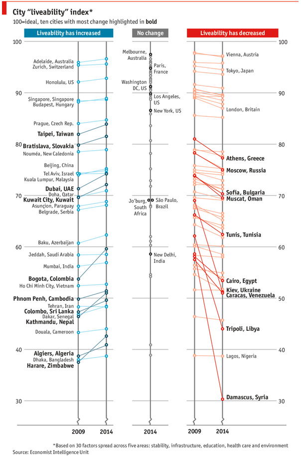
As you can see, this chart is not the best way to visualize “Best places to live”.
Few reasons why,
- The segregated views (blue, gray & red) make it hard to look for a specific city or region
- The zig-zag lines look good, but incredibly hard to understand % changes (or absolute changes)
- Labels are all over the place, thus making data interpretation hard.
- Some points have no labels (or ambiguous labels) leading to further confusion.
After examining the chart long & hard, I got thinking.
Its no fun criticizing someones work. Creating a better chart from this data, now thats awesome.
Continue »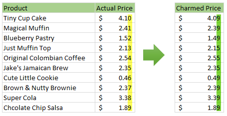
Here is a charming little problem to kick start your day.
Lets say you run a cute little bakery around the corner. Since you want your prices to look charming, you have a policy to round them down or up based on below rule.
If the price ends with 0, 1 or 2 cents, round it down to 9 cents.
If the price ends with 3, 4 or 5 cents, round it up to 5 cents.
If the price ends with 6, 7, 8 or 9 cents, round it up to 9 cents.
For example,
So how do you round to nearest charmed price? You could do it manually. But you would rather bake a few more of those Tiny Cup Cakes than waste time rounding the prices. So you want an automatic way to round prices. This is where Excel helps.
Continue »{ 14 Comments }
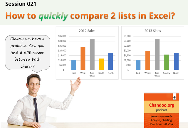
CP021: How to quickly compare 2 lists in Excel
Published on Oct 2, 2014 in Chandoo.org Podcast Sessions, Excel Howtos
Podcast: Play in new window | Download
Subscribe: Apple Podcasts | Spotify | RSS
In the 21st session of Chandoo.org podcast, lets compare lists. Quickly
What is in this session?
Comparing things is a favorite pastime for analysts all over the world. Sadly, it is also an area where we waste hours. So in this episode, I share my top secret comparison techniques to save you time.
Note: This is a short format podcast. That means you spend less time listening to it, while becoming more awesome.
In this podcast, you will learn,
- Why I sound like I am on a secret mission at a mafia hideout.
- 5 ways to compare 2 lists
- Manual method
- Conditional Formatting
- Row Differences
- LOOKUP formulas
- COUNTIF formulas
- Bonus tip: Removing duplicates
- Conclusions
{ 44 Comments }
ABC Inventory Analysis using Excel
Published on Oct 1, 2014 in Charts and Graphs, Learn Excel
ABC analysis is a popular technique to understand and categorize inventories. Imagine you are handling inventory at a plant that manufactures high-end super expensive cars. Each car requires several parts (4,693 to be exact) to assemble. Some of these parts are very costly (say few thousand dollars per part), while others are cheap (50 cents per part). So how do you make sure that your inventory tracking efforts are optimized so that you waste less time on 50 cent parts & spend more time on costly ones?
This is where ABC analysis helps.
We group the parts in to 3 classes.
- Class A: High cost items. Very tight control & tracking.
- Class B: Medium cost items. Tight control & moderate tracking.
- Class C: Low cost items. No or little control & tracking.
Given a list of items (part numbers, unit costs & number of units needed for assembly), how do we automatically figure which class each item belongs to?
And how do we generate above ABC analysis chart from it?
Continue »
