Archive for July, 2014
{ 5 Comments }
Become awesome in data analytics, charting & Power Pivot with Houston Masterclass [reminder]
Published on Jul 31, 2014 in Excel Workshops
Hello friends,
Let me stop our broadcast of Excel tips to bring an announcement.
Houston, we are going to get awesome

As you may know, I am doing 4 days of live masterclasses on Advanced Excel, Dashboards, Power Pivot & Data Analytics in Houston (Texas) this September.
- 15 & 16 September (Mon & Tue) on Advanced Excel & Dashboard Reporting
- 17 & 18 September (Wed & Thu) on Power Pivot & Data Analytics
This 4 day masterclass is aimed at managers, analysts, reporting professionals, executives in sales, marketing, customer service or anyone who wants to learn about Data Analytics, Advanced Excel, Dashboard reporting.
Please click here to know more.
Continue »{ 8 Comments }
CP015: Handling big data, Controlling model railroad sets, Overcoming Excel obsession & more – ASK CHANDOO
Published on Jul 24, 2014 in Chandoo.org Podcast Sessions
Podcast: Play in new window | Download
Subscribe: Apple Podcasts | Spotify | RSS
In the 15th session of Chandoo.org podcast, lets answer some of your burning Excel questions.

What is in this session?
Around last week, I invited you to ask me anything. More than 150 people responded to this call and sent in their questions. Since answering all the questions is not possible, I handpicked roughly 10 questions to answer in this episode of Chandoo.org podcast.
In this podcast, you will learn,
- How to fill blank cells with data from above
- How to work with Big data in Excel
- How to combine data from multiple sources & analyze it in Excel
- How I am managing my life after starting Chandoo.org
- How to create and distribute stand-alone Excel products
- How to control a model railroad set using Excel VBA (not fully answered)
- & more…

How to Count and Sum data from Filtered Tables
Continue »{ 20 Comments }
Ask me your Excel questions & You could win an eBook
Published on Jul 18, 2014 in Learn Excel

Time for another round of open-mic weekend.
As you know, Chandoo.org has been running a podcast show for last few months. We have completed 14 episodes as of today. For the 15th episode, lets have an “Ask Chandoo” as the theme.
What you need to do:
Simple. Head over to ask.chandoo.org and submit your questions. You can leave me a voice-mail or post your questions
What happens next?
I will listen (or read) your questions and choose a handful for the session 15 of our podcast.
What you get:
If your question is picked up for the podcast, you will receive the 25 Excel tips e-book.
Continue »{ 2 Comments }
How fireworks animated chart is made [video tutorial]
Published on Jul 17, 2014 in Charts and Graphs, VBA Macros
On July 4th this year, I published an animated fireworks chart for you. Many of you liked it. Quite a few wanted to know how its made.
So here is a video explaining the construction of fireworks.
(You can see this video on our YouTube Channel too)
Continue »{ 24 Comments }
CHOOSE() me, an introduction to Excel CHOOSE function
Published on Jul 16, 2014 in Learn Excel
Today lets learn about Excel CHOOSE() function.
CHOOSE eh? What does it do?
To understand CHOOSE() and appreciate its uses, lets invent an imaginary boos-subordinate pair.
Jasmine is the boss. She is, well, lets call her peculiar. She likes olives, Tuesdays & color Red. She hates potatoes.
Martin is the faithful butler of Jasmine. He is obedient, quirky and tall. He likes lotuses, Fridays & color blue. He hates potassium.
Enter Jasmine’s scarf problem:
Jasmine likes to wear a different colored scarf every weekday. She likes to wear Red colored scarf on Mondays & Tuesdays. She likes to put on the blue polka dot scarf on Wednesdays. On Thursdays, she wears her olive colored scarf. On Fridays & Saturdays, she prefers the lovely orange blue scarf. Sundays are no scarf days.
No wonder she is peculiar.
Continue »{ 8 Comments }
Here is a simple solution to your forgetful, leaky brian – “Just put it in a spreadsheet”
Published on Jul 14, 2014 in Learn Excel

This is a guest post written by Joel Zaslofsky, author of Experience Curating.
How to Make “Put It in a Spreadsheet” Who You Are (and Not Just What You Do)
It seemed like a crazy question:
Could I use my passion for Excel as motivation to transform my leaky brain from a weakness into a strength?
Sure, I already had a fifteen year love affair going with Excel.
Every other email I sent to my co-workers had an attached Excel spreadsheet. And when I wasn’t using Excel for work purposes, I was using it for grocery list templates or budget tracking.
But I had to discover the answer to my crazy question.
So I told my wife Melinda in January 2012, “Honey, this is the year I put it in a spreadsheet!”
Continue »{ 7 Comments }
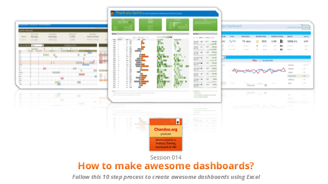
CP014: How to create awesome dashboards – 10 step process for you
Published on Jul 10, 2014 in Chandoo.org Podcast Sessions, Charts and Graphs
Podcast: Play in new window | Download
Subscribe: Apple Podcasts | Spotify | RSS
In the 14th session of Chandoo.org podcast, lets figure out how to make awesome dashboards.
What is in this session?
Excel based dashboards are much in demand these days, thanks to advancements in Excel & growing pressure on costs. Now a days, analysts & managers are expected to quickly put together a dashboard using Excel. But how do you make a dashboard? What process you should follow? These are the questions we address in this podcast.
In this podcast, you will learn,
- Announcements about upcoming dashboard classes
- Ten step process for creating awesome dashboards
- 1. Talk to your end users
- 2. Make a sketch of the dashboard
- 3. Validate your understanding
- 4. Collect data
- 5. Structure the data
- …
{ 2 Comments }
Come join me at Excelapalooza conference in Dallas or Masterclass at Houston this September
Published on Jul 9, 2014 in Excel Workshops, Training Programs

If you listen carefully, you can hear my screams of joy. I have 2 very happy news to share with you.
- I am speaking at Excelapalooza Excel conference, happening at Dallas (Texas) between September 21 to 24.
- I will be conducting an Advanced Excel, Dashboards & Power Pivot masterclass at Houston (Texas) between September 15 to 18.
{ 29 Comments }
Winners of state migration dashboard contest
Published on Jul 7, 2014 in Charts and Graphs, Excel Challenges
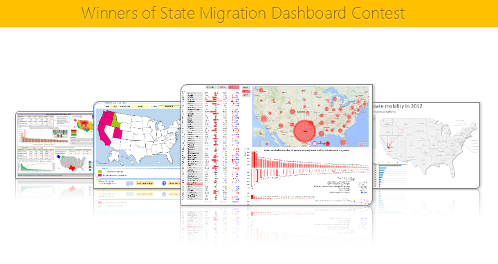
Finally the wait is over. Here are the winners of our 2014 dashboard contest. Check them out.
Continue »{ 39 Comments }
4th of July Fireworks – an Excel animation for you
Published on Jul 4, 2014 in Charts and Graphs, VBA Macros
To all our readers & friends from USA,
I wish you a happy, fun & safe 4th of July.
For the last 4th of July (2013), we (Jo, kids & I) were in USA. We went to Washington DC to meet up a few friends for that weekend. And we had one of the most memorable evenings of our lives when we went to national mall area in the evening to watch beautifully choreographed fireworks. Kids really loved the amazing display of fire-crackers and enthusiasm.
While we all are back in India this time, it doesn’t mean we cant celebrate 4th of July. So I made some fireworks. In Excel of course.
Here is a little Excel animation I made for all of us.
4th of July Fireworks – Excel animation
First watch this quick demo (<15 secs)
Continue »{ 4 Comments }
CP013: Is this a FIFA worldcup of late goals, lets ask Excel [How to analyze data to answer questions like these…]
Published on Jul 3, 2014 in Chandoo.org Podcast Sessions, Charts and Graphs
![CP013: Is this a FIFA worldcup of late goals, lets ask Excel [How to analyze data to answer questions like these…]](https://img.chandoo.org/podcast/session-013.png)
Podcast: Play in new window | Download
Subscribe: Apple Podcasts | Spotify | RSS
In the 13th session of Chandoo.org podcast, lets turn our attention to on-going FIFA worldcup and ask an important question.
What is in this session?
A week ago, we discussed “Has it been a late goal FIFA worldcup?” and used various charts & analysis techniques to answer the question. In podcast, lets tackle the same problem, understand various approaches to answer questions like these & shares some lessons for all the analysts.
{ 8 Comments }
A quick Excel tip for you while on a long bike trip…,
Published on Jul 1, 2014 in Charts and Graphs
Hi friends,
I have a surprise for you. Between the late night world-cup matches & my reinvigorated thirst for biking, I have difficulty finding time to write a long & detailed article for you. So I thought why not say hello to you and share an Excel tip while I am on a biking trip.
Go ahead and check it out. Its just 4 minutes.
Watch it below or on our YouTube channel.
Continue »
