Archive for April, 2013
This is a personal note, not an Excel tip. So grab a cup of coffee, relax and read on. As I pack our bags and run the last checks, one thought keeps crossing my mind. ‘How impossible all this sounded just a few years ago’. When I quit my well paying corporate job in April, […]
Continue »{ 13 Comments }
10 Rookie mistakes to avoid when making dashboards [video]
Published on Apr 25, 2013 in Charts and Graphs
Are you making these 10 rookie mistakes when creating dashboards?
Watch below to video to understand what these mistakes and how to avoid them.
10 Rookie mistakes to avoid when making dashboards [23 mins]

{ 109 Comments }
How to create an Interactive Chart in Excel? [Tutorial]
Published on Apr 23, 2013 in Charts and Graphs, Excel Howtos
![How to create an Interactive Chart in Excel? [Tutorial]](https://cache2.chandoo.org/images/c/interactive-chart-in-excel-demo.gif)
Imagine you have a worksheet with lots of charts. And you want to make it look awesome & clean.
Solution?
Simple, create an interactive chart so that your users can pick one of many charts and see them.
Today let us understand how to create an interactive chart using Excel.
Continue »{ 6 Comments }
Chart for wall hygrometric physic (or how to create a chart with custom x axis intervals?)
Published on Apr 18, 2013 in Charts and Graphs
Livio, one of our readers from Italy sent me this interesting problem in email.
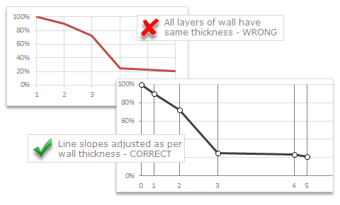
Continue »I would like to prepare an xy linear graphic as representation of the variation of temperature trough a wall between two different bulk temperature i.e. outside and inside a house. This graphic should show the temperature gradient trough the wall thickness. The wall is normally made by different construction materials (different layers, as bricks, insulation, …..) and so the temperature change but not as a straight line with only one slope, instead as few lines with different slopes (see below figure) Calculations are not difficult, and also prepare the graphic also not difficult.
But, I am looking a beautiful solution for x-axis. X-axis should be divided not with constant interval, instead with different length between each sub-division exactly as the different thickness of the wall. This is a correct graphic, because you can show the correct slope of each straight line though each layer of the wall.

Last week, we had a lovely poll on what are your favorite features of Excel? More than 120 people responded to it with various answers. So I did what any data analyst worth his salt would do,
I analyzed the data and here are the top 10 features in Excel according to you.
Read on to learn more.
Continue »{ 39 Comments }
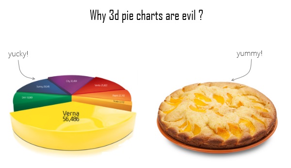
Some charts try to make you an April fool all the time (or why 3d pie charts are evil)
Published on Apr 12, 2013 in Charts and Graphs
Recently I saw a big screaming ad that said “the chartbuster rules”. Of course, I know that chartbusters rule. Not just because I was one of them 🙂
So I got curious and read on. And I realized the ‘chartbuster’ is actually a car, not some cool, spreadsheet waving, goatee sporting dude like Jon Peltier. What a bummer!
And then to my horror of horrors, I saw the exploding 3d pie chart, with reflection effects & glossy colors. And the sole purpose of the chart is to create an impression that Verna sells better than any car in India.
Today, lets talk about this chart and alternatives for it. Read on.
Continue »![How to create interactive calendar to highlight events & appointments [Tutorial]](https://img.chandoo.org/vba/interactive-event-calendar-in-excel.png)
One of the popular uses of Excel is to maintain a list of events, appointments or other calendar related stuff. While Excel shines easily when you want to log this data, it has no quick way to visualize this information. But we can use little creativity, conditional formatting, few formulas & 3 lines of VBA code to create a slick, interactive calendar in Excel. Today, lets understand how to do this.
Continue »{ 131 Comments }
What is your favorite feature of Excel? [poll]
Published on Apr 5, 2013 in Learn Excel
![What is your favorite feature of Excel? [poll]](https://img.chandoo.org/polls/what-is-your-favorite-excel-feature-poll.jpg)
Its Friday, time for another poll.
This weeks topic is inspired from a discussion Jordan started in our forums.
I will go first.
My favorite features are,
Conditional formatting: Quickly highlight something that is not alright (or meets conditions), see trends with data bars or heat maps.
Pivot tables: Turn data in to understandable information with just a few clicks. When combined with slicers & conditional formats, becomes very powerful.
Formulas: Ofcourse, with out formulas, Excel would be a glorified notepad!
What about you? What are your favorite features in Excel? Go ahead and share with us by posting a comment.
Continue »
Last week, we had our very first quiz – “How well do you know your LOOKUPs?”. I hope you have enjoyed it.
Today lets understand the answers & explanations for this quiz.
Continue »{ 48 Comments }
10 things that wowed me in Excel 2013
Published on Apr 3, 2013 in Charts and Graphs, Learn Excel
As you may new, the newest version of Excel is out for a while. I have been using it since last 6 months and enjoying it. Today, lets understand 10 things in 2013 that wowed me (and probably you too).
Continue »{ 143 Comments }
Unlock “Angy Formulas” – an Angry Birds like game hidden in Excel using this trick!!!
Published on Apr 1, 2013 in excel apps
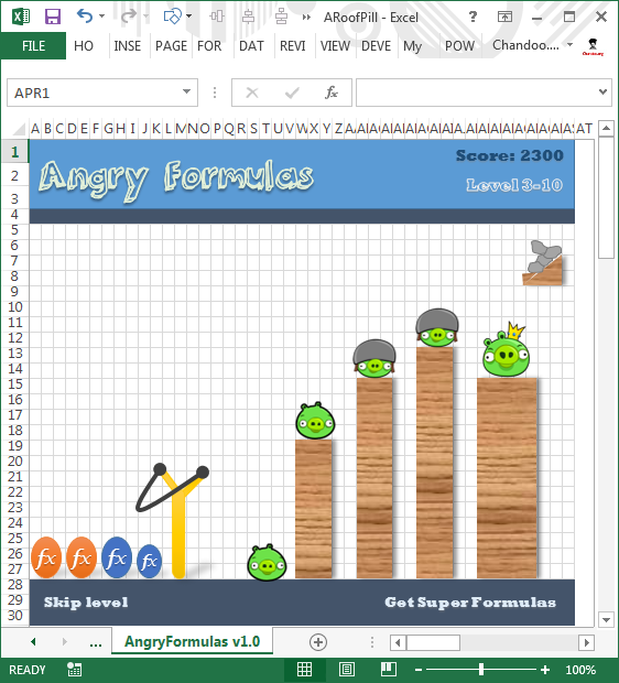
Sometimes you think you know something and then suddenly you are surprised. Yesterday was such a moment for me. I have been using Excel for almost a decade now. So naturally I assumed that I know it well. But then yesterday, while doing something I stumbled on a strange screen in Excel that looked like very popular Angry birds game. So I got searching. But there was no mention of it anywhere on net. Then I asked my friend Rollf ‘O’ Pai, who is in Micros0ft Execl team. First he denied such a thing. But we knew each other so well that he could never lie to me. So he confided. He told me what I had suspected for several years.
There is an Angry birds like video game buried in Excel!!! It was meant to be an Easter egg in Excel 2010 (and 2013), but due to backlash from senior management no one ever published the details about it.
So I asked him “How do I unlock it?”. Rollf ‘O’ Pai asked me to never reveal it to anyone and then told me the recipe.
Once I unlocked I could not believe how cool it is!
Read on to understand how to unlock this game.
Continue »
